Talk Page for TWikiUsability
I'm evaluating TWiki for my company (Main.TWikiStoryOfMaxFordhamLLP) and am currently focused on usability issues. I love the Admin side but am nervous about easy of use for new and occassional users. I'm writing this up at TWikiUsabilityTestingAtMaxFordham -- TamsinTweddell - 29 Jul 2007 Twiki was my first taste of wiki and I have to say it works really well. The admin interface is superb. One of the problems I have in selling it to those who are unfamiliar is that it has a reasonably unique markup and little by way of help for the day to day editors of the content. Having used it consistently for six months and an experienced coder I got used to it, but it was more awkward for those doing one entry, leaving it then coming back to it some time later. As a "power user", twiki is very elegant. Based on some work by Barry Crabtree and Cefn Hoile, I have extended the stylesheet metaphor and defined the templates within the twiki as well. This allows the maintenance of the site to be done purely through the user interface. However, for the basic editor, mediawiki with its graphical markup bar has a definite edge. -- SamJWatkins - 09 Dec 2007 We are working hard to integrate a visual markup editor with the new release (4.2). -- ArthurClemens - 09 Dec 2007 And if all you need is a graphical markup bar like MediaWiki - TWiki has several Plugins - the most current being NatEditContrib -- SvenDowideit - 09 Dec 2007 TWikiUsability: Thanks to Carlo for yet another cool and useful article on usability, that gives a good overview. This article should be promoted on the Codev-frontpage. -- MartinSeibert - 24 May 2008 I gave a TWiki-Heart for these valuable usability-contributions (TWikiUsability, UsabilityCategoriesAndHeuristics) to Carlo Schulz. He is our Usability-Champion! - TWikiHeart -- MartinSeibert - 24 May 2008 Comments moved here from TWikiCommunitySummit2008Q3, regarding the agendum "A face-lift for TWikis user interface (improve usability)" IMHO this is an absolute must have for a 5.0 release and it is as important as things like storage model and other technical things that happen in the background. -- CarloSchulz - 14 Aug 2008 I've done a lot interface work for our TWiki at IBM which I'd like to demo. I'll try to transfer the ideas/designs into a more generic wire frame so that the resulting proposal wont depend on a specific skin. -- CarloSchulz - 14 Aug 2008 IMHO - we do not need a face lift and another attempt on destroying the wonderful user interface we have now. We should create new alternative skins. Not destroy the wonderful Pattern skin UI we have now. Users don't want the UI to change at each TWiki upgrade. -- KennethLavrsen - 14 Aug 2008 Yeah, right. Ever thought about that there is a big difference between being perfectly used to an interface and an perfect interface? Don't try telling me the current interface is perfect - that would mean a 0 on your NerdoMeter. It's like me telling the techies in here we really don't need a new storage model, query language, meta data representation, caching or what ever. "Users don't want the UI to change at each TWiki upgrade." Who the hell is talking about changing it each time? 5.0 is a major release, not just an upgrade. If your argument was valid we would still have the Cairo interface. You are damn right about "We should create _new alternative skins"_. But have you ever asked yourself why there is a demand for alternative skins if the currrent one is already perfect? If you don't want an improved standard interface - fine, but you are not "the users". Ask Peter about the major concerns of his customers regarding TWiki - if you were right usability wasn't one of them. I'm sorry if my language is rude or offending. I fully respect your statement and personal opinion. I knew you would give such an answer but the way you did is quite frustrating. I'm offering help on a domain where I can help the TWiki Project the most. To me your statement reads as "thanks dude, but we don't need your contribution" simply because you don't need it. You reject it without even looking at a single proposal. -- CarloSchulz - 15 Aug 2008 I'm with Carlo on this. The current user interface is quirky, slow, and difficult to use, and is most definitely an issue with my customers. The usability issues are not just related to Pattern skin, but also to the underlying architecture of TWiki. For example, the redirection to an "oops" page is an utter PITA for usability. So isoopsmore. I could go on.
Perhaps usability could be improved within the framework of Pattern Skin - maybe this will be possible, maybe not - but I for one doubt it.
Go Carlo! I'll be the first dev to sign up to your task team, even before I know what you want to do!  -- CrawfordCurrie - 15 Aug 2008
Carlo you were taking it for granted that we all want a face lift of TWiki without questioning IF we needed one. I react on that and I express my oppinion freely and openly no matter how many think the opposite!
-- CrawfordCurrie - 15 Aug 2008
Carlo you were taking it for granted that we all want a face lift of TWiki without questioning IF we needed one. I react on that and I express my oppinion freely and openly no matter how many think the opposite! - I'm not taking it for granted that each and everyone wants a face lift. I've just overheard so many times consultants talking about how their clients suffer from twiki's usability and interface shortcomings.
- Do you really think that this is my unterstanding of improving an interface?
- Where is the edit button?
- Where is the print preview?
- Where do I see who last edited the topic?
- Where do I click to see the changes since last last revision of the topic?
- Where is the button for attaching a file?
- Where is the link to WebChanges?
- Where is the list of webs?
- 100% agreement on this one

- Never said this is wrong.
Having a frozen Pattern skin and leaving it as a default extension that must work would also ensure that we do not AGAIN change the basics for the skins destroying the skins mods people have made and AGAIN making it impossible to upgrade TWiki.
- again, 100% agreement on this one
- Do you think this is my intention? Marketing? For what? I don't earn any money with TWiki...
- Actually this metaphor is better than you might think. Remembering your very first driving lessons? I remember mine - horror. So many controls and buttons while I was already overloaded with just trying to drive. So what is the solution to this? Like you said it is definitely not removing these things. You need them once you mastered the basics of driving. But you really do not want to tell me that it is not a good idea to arrange the controls in a way so they don't get in the way of a learner? Making both parties happy is the goal of a good user experience!
- Ooh, really? And I thought I was using TWiki too...
- I'm really wondering where your impression is coming from that I want to destroy things.
- The number of and location of basic UI controls in normal view mode (usability of experienced users)
- The compatibility with tailoring of left bars and top bars (upgrade hell)
- The change of font sizes again so everything gets badly alligned in tables and similar. (application upgrade hell)
- Agian, almost 100% agreement
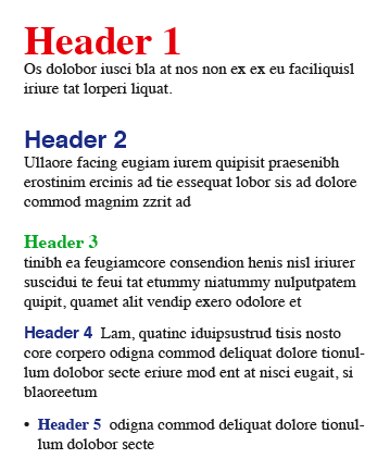 The key is that like information goes together. It is separated by more space between it and other dissimilar information, but by less space between the elements of the like information. There is some established visual pattern that defines the level of separation of the groups of information. Not an enormous difference. Not a rainbow of color or fonts. But just enough to tell, at a glance, how the information is organized. It's this that our users most find lacking. H2 through H4 or H5 are exactly or almost exactly the same size. The higher head levels use a roman font, but the lower head levels use a bold font. And the color of all heads is the same (this alone would not be a crime, it's just a more serious problem when there is no distinction in size and spacing).
-- DavidWolfe - 15 Aug 2008
Kenneth, see my comments in red. Actually we are not that far away from each other. IMHO it is mainly a communication issue.
A personal remark about your comment though.
Maybe I'm young but I work as a Consultant for Usability, User Experience, Information Design/Interaction or what ever you want to called it for some years already.
It's my business and my pleasure too help improving things. That, and nothing else is my reason for being here on TDO. If you feel it's not needed or you don't want me too help - fine.
I never received any negative feedback for any of my work so far. I worked for small and big clients. I worked with different types of interfaces, web sites, mobile phones (motorola phones for example ), white ware. The list goes on.
The key is that like information goes together. It is separated by more space between it and other dissimilar information, but by less space between the elements of the like information. There is some established visual pattern that defines the level of separation of the groups of information. Not an enormous difference. Not a rainbow of color or fonts. But just enough to tell, at a glance, how the information is organized. It's this that our users most find lacking. H2 through H4 or H5 are exactly or almost exactly the same size. The higher head levels use a roman font, but the lower head levels use a bold font. And the color of all heads is the same (this alone would not be a crime, it's just a more serious problem when there is no distinction in size and spacing).
-- DavidWolfe - 15 Aug 2008
Kenneth, see my comments in red. Actually we are not that far away from each other. IMHO it is mainly a communication issue.
A personal remark about your comment though.
Maybe I'm young but I work as a Consultant for Usability, User Experience, Information Design/Interaction or what ever you want to called it for some years already.
It's my business and my pleasure too help improving things. That, and nothing else is my reason for being here on TDO. If you feel it's not needed or you don't want me too help - fine.
I never received any negative feedback for any of my work so far. I worked for small and big clients. I worked with different types of interfaces, web sites, mobile phones (motorola phones for example ), white ware. The list goes on. There was not a single project that ended up with an interface that was worse than the one we had before the project. Our clients would tell us for sure if things would get worse instead of better. I'm far away from being a guru in this domian, but trust me, I know my business quiet good. And I definitely don't need you telling me how interfaces work, what the results of changes might be, that different users have different needs. I'm not stupid. And in this context I would like to ask you to stop talking to me like I just discovered the internet! -- CarloSchulz - 15 Aug 2008 Kenneth, what's going on here? Did you have a bad time and feel like Carlo needs getting ranted all over? Please, pipe down and let the good guys do good things. Keep your Motorola users on PatternSkin, but let us move on. -- MichaelDaum - 15 Aug 2008 I guess it is the word facelift that made me assumed yet another moving around the UI controls. That combined with some of the proposals I have seen lately for the twiki.org face lift where this is exactly what was proposed --- moving around everything. If what Carlo wants is improve usability I am all in. But if it is moving UI around or hiding the controls like raw view, backlinks, history etc then I am against. I guess we should use another word than facelift then because facelift triggers me to think the eternal moving around of controls we know and hate in Microsoft software. -- KennethLavrsen - 15 Aug 2008 Kenneth, back off, please. -- MichaelDaum - 16 Aug 2008 I totally support Carlo in this. The problem is that the functional interface has been frozen for years now because of the small develop windows we had (and in that time it was more important to fix bugs). Let's move it forward and create a better (new) user experience. -- ArthurClemens - 16 Aug 2008 Micheal and Carlo - I do not know why my input is seen as ranting Carlo. I have explained that it is the word face lift I understood differently and it has been clarified that Carlo meant something else. I hope back off does not mean shut up. If we can all agree
- Make a new beautiful girl and not give the old one a face lift
- Ensure the old one still works and is part of the default distribution
- We will see more alternative skins in future because people will be more likely to make skins if they know they will work in future
- People will be able to make much more tailored skins that fit their corporate identity - and trust they still work when they upgrade TWiki.
- A pattern skin or Natskin that follows the API will also work in future.
 -- MichaelDaum - 17 Aug 2008
I am ordering that T-shirt. I love it.
-- KennethLavrsen - 17 Aug 2008
On its way
-- MichaelDaum - 17 Aug 2008
If you've read my comments (and maybe re-read yours) you should know what led to the impression of ranting.
As you've already proven a good sense of humor maybe this dilbert strips is helping you to understand it:
-- MichaelDaum - 17 Aug 2008
I am ordering that T-shirt. I love it.
-- KennethLavrsen - 17 Aug 2008
On its way
-- MichaelDaum - 17 Aug 2008
If you've read my comments (and maybe re-read yours) you should know what led to the impression of ranting.
As you've already proven a good sense of humor maybe this dilbert strips is helping you to understand it:
 -- CarloSchulz - 18 Aug 2008
I just would like to comment, that TWiki definitely and urgently need an increase in usability, in case you want a broader range of companies and communities using it. Otherwise they move on to Xwiki or other sources.
If you just want to have one of the best Wikis (if not the best ) and want to keep it a hidden secret then it is fine as it is.
-- WolfMarbach - 21 Aug 2008
I am all for improving usability.
It was originally a one liner on an agenda I reacted against because it said "give TWiki a face lift". And I understood face lift as moving some buttons around and changing some colours without actually making any improvements. We have later had clearly clarified that Carlo meant something else than what I understood.
There are lots of things usability related that can be much better in TWiki and I look forward to seeing and participating in making these changes.
I have stared working on a sort of requirement spec for what I think needs to be defined as an "API" for the skins and for the Pattern Skin in particular. I am about half way done and I will post it when I am have a full draft ready. Then you all will understand much better what it is I feel is worth protecting. It is not really that much I want to freeze. Stay tuned.
In the meanwhile try reading UpgradeTesting (read the comment from David Wolfe and Sean C Morgan). Interesting comments from upgraders.
-- KennethLavrsen - 21 Aug 2008
UpgradeTesting is definitely an interesting read (though it doesn't let you feel that good about TWiki
-- CarloSchulz - 18 Aug 2008
I just would like to comment, that TWiki definitely and urgently need an increase in usability, in case you want a broader range of companies and communities using it. Otherwise they move on to Xwiki or other sources.
If you just want to have one of the best Wikis (if not the best ) and want to keep it a hidden secret then it is fine as it is.
-- WolfMarbach - 21 Aug 2008
I am all for improving usability.
It was originally a one liner on an agenda I reacted against because it said "give TWiki a face lift". And I understood face lift as moving some buttons around and changing some colours without actually making any improvements. We have later had clearly clarified that Carlo meant something else than what I understood.
There are lots of things usability related that can be much better in TWiki and I look forward to seeing and participating in making these changes.
I have stared working on a sort of requirement spec for what I think needs to be defined as an "API" for the skins and for the Pattern Skin in particular. I am about half way done and I will post it when I am have a full draft ready. Then you all will understand much better what it is I feel is worth protecting. It is not really that much I want to freeze. Stay tuned.
In the meanwhile try reading UpgradeTesting (read the comment from David Wolfe and Sean C Morgan). Interesting comments from upgraders.
-- KennethLavrsen - 21 Aug 2008
UpgradeTesting is definitely an interesting read (though it doesn't let you feel that good about TWiki  ). Thanks for the tipp. However, the more I think about this whole UI thingy it becomes quiete obvious that we need a proper UserInterfaceStrategy. There are simply too much things to consider before we should even start thinking about a specific design.
-- CarloSchulz - 22 Aug 2008
). Thanks for the tipp. However, the more I think about this whole UI thingy it becomes quiete obvious that we need a proper UserInterfaceStrategy. There are simply too much things to consider before we should even start thinking about a specific design.
-- CarloSchulz - 22 Aug 2008
| BasicForm | |
|---|---|
| TopicClassification | Select one... |
| TopicSummary | |
| InterestedParties | |
| RelatedTopics | |
Topic revision: r20 - 2008-08-22 - CarloSchulz


Copyright © 1999-2026 by the contributing authors. All material on this collaboration platform is the property of the contributing authors.