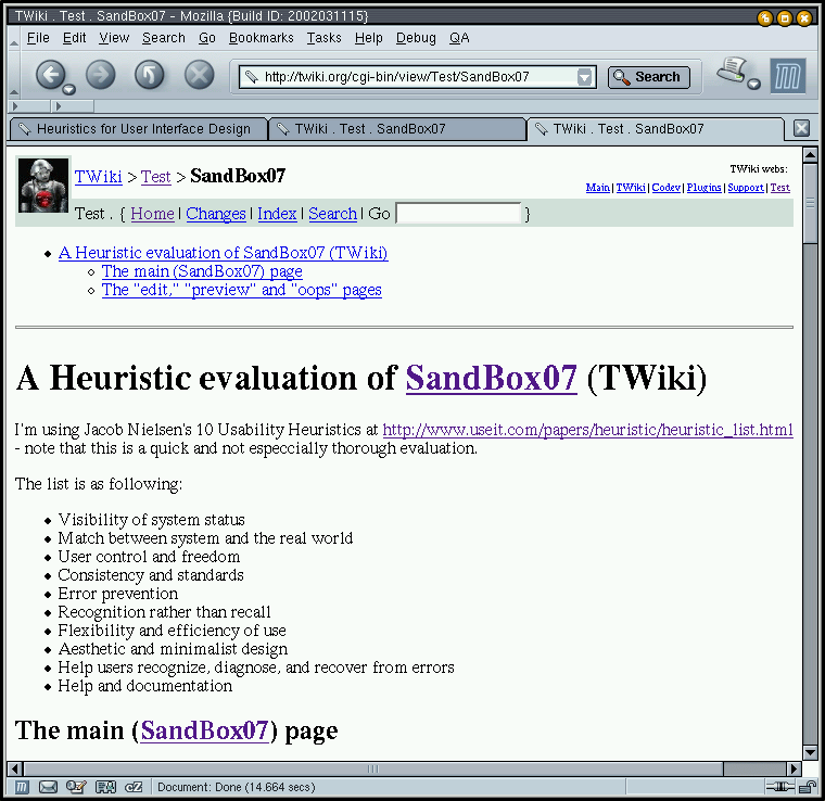
A Heuristic evaluation of (parts of) TWiki
- Introduction
- The "main" page
- Visibility of system status
- Match between system and the real world
- User control and freedom
- Consistency and standards
- Error prevention
- Recognition rather than recall
- Flexibility and efficiency of use
- Aesthetic and minimalist design
- Help users recognize, diagnose, and recover from errors
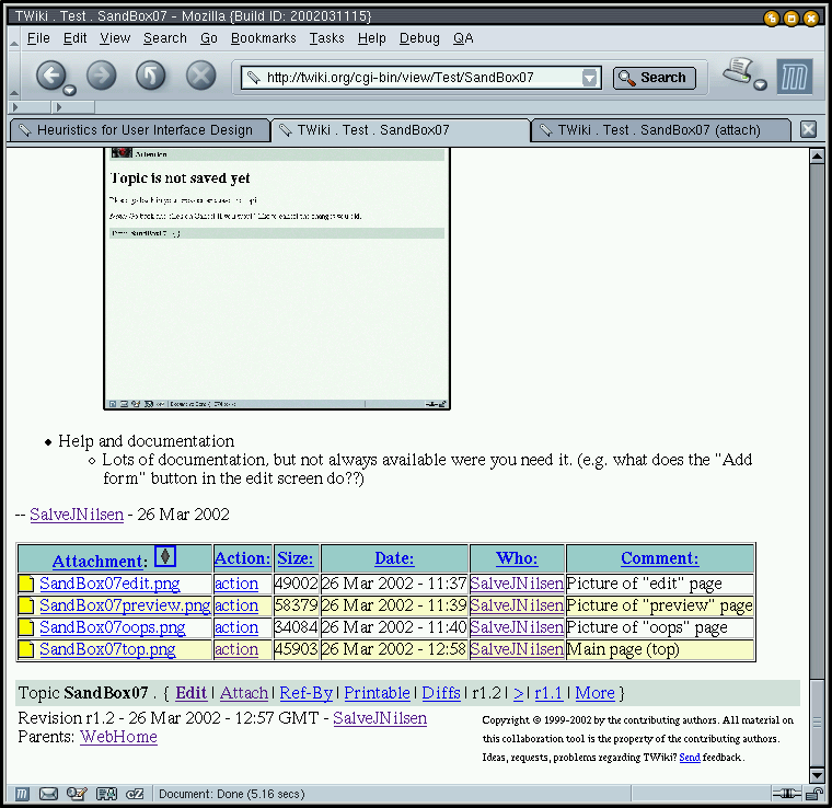
- Help and documentation
- The "edit," "preview" and "oops" pages
- Visibility of system status
- Match between system and the real world
- User control and freedom
- Consistency and standards
- Error prevention
- Recognition rather than recall
- Flexibility and efficiency of use
- Aesthetic and minimalist design
- Help users recognize, diagnose, and recover from errors
- Help and documentation
Introduction
I'm using Jakob Nielsen's 10 Usability Heuristics at http://www.useit.com/papers/heuristic/heuristic_list.html- Visibility of system status
- Match between system and the real world
- User control and freedom
- Consistency and standards
- Error prevention
- Recognition rather than recall
- Flexibility and efficiency of use
- Aesthetic and minimalist design
- Help users recognize, diagnose, and recover from errors
- Help and documentation
The "main" page
Visibility of system status
- The top line describes at any time which TwikiWeb you are located in, and which webpage you are reading. Relations between current page and TwikiWeb is shown, but relations between the current page and other webpages aren't easily accesible (You can follow the "Ref-By" link at the bottom, or see what page is considered the "parent" of the current document.) A list of "useful webs" is avialable at the top-right, but this list is non-obvious to update, and a similar (easily updateable) "most useful webpages" list would be nice.
- Different colors between webs are good.
- Main page (top):

Match between system and the real world
- "Real world conventions" aren't used much, and instead WikiWords, "curly braces text" (see list of twikiwebs at top of page for example) and other system-oriented terms are used (e.g. the warning about IE at the bottom of the page.) Not good.
User control and freedom
- No need for "undo" and "redo" regarding normal viewing of webpages. "Emergency exits" exist (link to current twikiweb and to mail twiki page in the title fields)
Consistency and standards
- [to be continued]
Error prevention
Recognition rather than recall
Flexibility and efficiency of use
Aesthetic and minimalist design
Help users recognize, diagnose, and recover from errors
Help and documentation
- Main page (bottom):
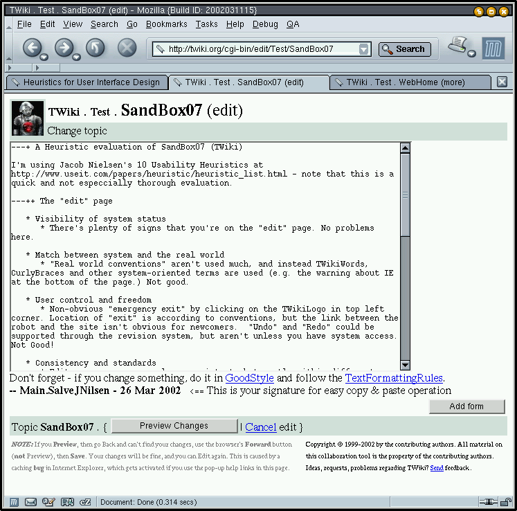
The "edit," "preview" and "oops" pages
Visibility of system status
- There's plenty of signs that you're on the "edit" page. No problems here.
- Picture of "edit" page:

Match between system and the real world
- Same as above.
User control and freedom
- Non-obvious "emergency exit" by clicking on the TWikiLogo in top left corner. Location of "exit" is according to conventions, but the link between the robot and the site isn't obvious for newcomers. "Undo" and "Redo" could be supported through the revision system, but aren't unless you have system access. Not Good!
Consistency and standards
- Edit pages are more or less consistent, but mostly within different TWikiWebs. Consistency across TWikiWebs are OK, but featuredependent (Which is OK, as long as the differences in features are properly shown and explained.)
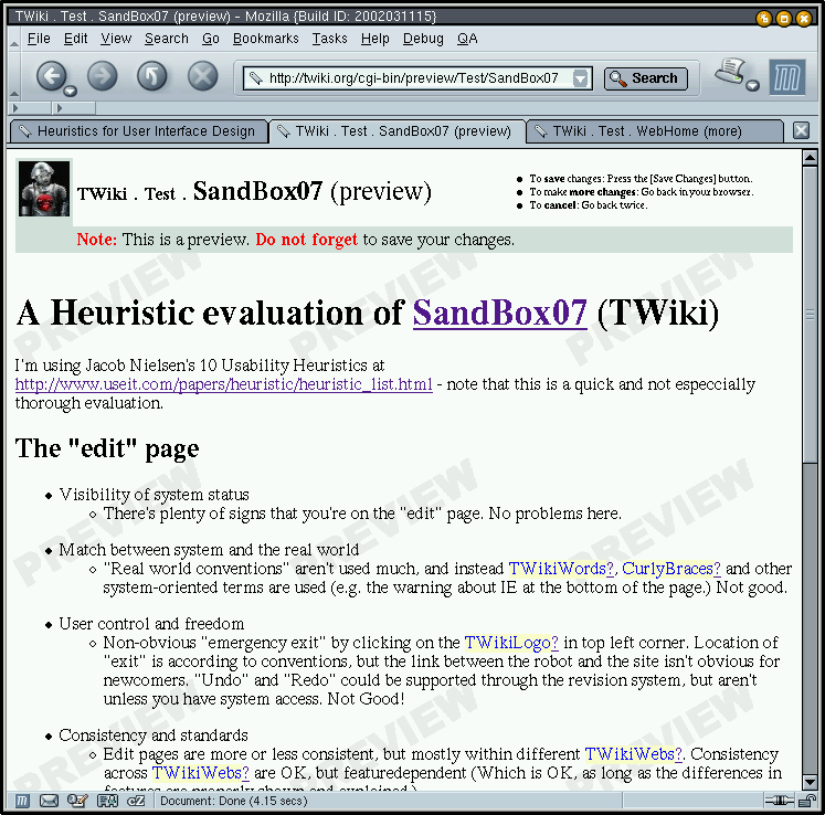
Error prevention
- "Preview Changes" is useful in preventing content errors, but if the browser should crash in the middle of editing a large document, all editing is lost.
- Picture of "preview" page:

Recognition rather than recall
- Reminders for using GoodStyle and TextFormattingRules are below, but these explain only a small subset of useful features available. More links should be available, perhaps to a list of TWikiFeatures?
Flexibility and efficiency of use
- Customizability of the user interface (other than changing the looks of twiki with templates) is very limited. Not good!

Aesthetic and minimalist design
- Short, light and not to sweet. Good minimalistic design, but maybe at the expense of needed documentation of features.
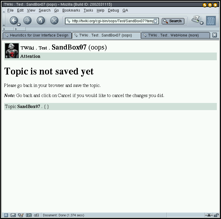
Help users recognize, diagnose, and recover from errors
- Error report ("oops page") when following a link in preview-mode. Very good!
- Picture of "oops" page:

Help and documentation
- Lots of documentation, but not always available were you need it. (e.g. what does the "Add form" button in the edit screen do??)


| I | Attachment | History | Action | Size | Date | Who | Comment |
|---|---|---|---|---|---|---|---|
| |
SandBox07bottom.png | r1 | manage | 73.3 K | 2002-03-26 - 13:03 | UnknownUser | Main page (bottom) |
| |
SandBox07edit.png | r1 | manage | 47.9 K | 2002-03-26 - 11:37 | UnknownUser | Picture of "edit" page |
| |
SandBox07oops.png | r1 | manage | 33.3 K | 2002-03-26 - 11:40 | UnknownUser | Picture of "oops" page |
| |
SandBox07preview.png | r1 | manage | 57.0 K | 2002-03-26 - 11:39 | UnknownUser | Picture of "preview" page |
| |
SandBox07top.png | r2 r1 | manage | 44.8 K | 2002-03-26 - 12:58 | UnknownUser | Main page (top) |
Topic revision: r6 - 2006-07-12 - PeterThoeny


Copyright © 1999-2026 by the contributing authors. All material on this collaboration platform is the property of the contributing authors.