TWiki Form Field Extensions
 Extensions that define additional form field types for TWikiForms. This is in addition to the built in form field types documented in TWikiForms.
| Extension | Type | Description | Size | Value |
|---|---|---|---|---|
| AutocompletePlugin | autocomplete |
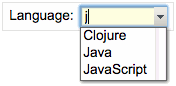 Autocomplete input field. Start typing to get a list of items to choose from, or click on the pulldown button to see all items. Autocomplete input field. Start typing to get a list of items to choose from, or click on the pulldown button to see all items. |
Size of input field in number of characters | Comma-space separated list of autocomplete options |
| AutocompletePlugin | autocomplete+restrict |
Autocomplete, where input is restricted to list of autocomplete options. The value in the input field will be cleared if it does not match one of the autocomplete options. Partial input is expanded - for example if one of the options is "JavaScript" and the user typed "ja", the input field is expanded to "JavaScript" on focus loss. | ||
| AutocompletePlugin | autocomplete+values |
Like autocomplete, allowing definition of inserted values that are different to the displayed autocomplete options. An autocomplete option is defined as value: title, where the value is the text inserted into the input field when picking the title option. For example:| Field 9 | autocomplete+values | 3 | One, 2: Two, III: Three | Various values formats | shows autocomplete options but the inserted values of autocomplete options Two and Three are 2 and III, respectively. Note: Autocomplete types can be combined: autocomplete+restrict+values |
||
| ColorPickerPlugin | color |
 Single-line text box and a color picker to pick a color. The color can also be typed into the text box, such as Single-line text box and a color picker to pick a color. The color can also be typed into the text box, such as #123456. An attribute of type="popup" shows a button that, when clicked, opens a color picker popup. |
Text box width in number of characters | Initial (default) color |
| DatePickerPlugin | date |
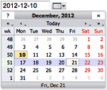 Text input field and a button next to it to pick a date from a pop-up calendar. The date can also be typed into the text box. Text input field and a button next to it to pick a date from a pop-up calendar. The date can also be typed into the text box. |
Text box width in number of characters | Initial (default) date |
| FileUploadPlugin | file |
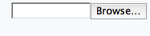 File upload form field, to upload an attachment to the topic when saving the form. File upload form field, to upload an attachment to the topic when saving the form. |
Text box width in number of characters | |
| PercentCompletePlugin | percent |
 Percent complete indicator and pick list. The percentage can be set by clicking on the percent complete indicator bar, or by picking a value from the pick list. Percent complete indicator and pick list. The percentage can be set by clicking on the percent complete indicator bar, or by picking a value from the pick list. |
N/A | Initial (default) percentage value |
| RatingContrib | rating |
 Line-of-stars rating bar. Line-of-stars rating bar. |
Number of stars for rating | Initial value |
| RatingContrib | rating+small |
 Like Like rating, but with small stars. |
||
Comments
Topic revision: r3 - 2012-08-17 - PeterThoeny

 Site map
 Blog web
 Index
Index Search
 Search extensions
 Search by tags
 Changes
 Notifications
 RSS Feed
 Statistics
 Preferences
 Community
  Readme first!
 Rate extensions!
 Add-Ons
  Development topics
 Idea topics
 Plugins
  Development topics
 Idea topics
 Skins
Skins  Development topics
 Idea topics
 Code Contribs
  Development topics
 Idea topics


 Account
 Ideas, requests, problems regarding TWiki? Send feedback. Ask community in the support forum.
Copyright © 1999-2026 by the contributing authors. All material on this collaboration platform is the property of the contributing authors.