TWiki Variables » Search » Category: Database & Forms
Variables in this category:
- AUTOCOMPLETE{} -- autocomplete input field for use in HTML forms
- COLORPICKER{} -- color picker for use in HTML forms for TWiki applications
- COMMENT{ attributes } -- insert an edit box into the topic to easily add comments.
- DATATBL{"topic" format="..."} -- look up a table
- DATEPICKER{} -- pop-up calendar to select a date for use in HTML forms
- EDITTABLE{ attributes } -- edit TWiki tables using edit fields and other input fields
- EXECUTE{ "script" } -- safely execute shell scripts or Perl code - use TWiki as the user interface for external applications
- HIERARCHICALSELECT{ attributes } -- display hierarchical multi-level drop-down menus
- JIRAREST{"..."} -- call JIRA issue tracker using REST API
- LDAP{"filter" format="format"} -- LDAP directory query
- LDAPUSERS{...} -- LDAP user information
- PERCENTCOMPLETE{} -- percent complete selector for use in HTML forms
- RENDERFORM -- render TWiki Forms data within a topic
- TWIKISHEET{} -- enable TWiki Sheet (spreadsheet) and set options
- VOTE{ id="..." } -- define a poll in a TWiki topic
AUTOCOMPLETE{} -- autocomplete input field for use in HTML forms
- Combo box input field with autocomplete. Start typing to see matching options to pick from. The
%AUTOCOMPLETE{}%variable is handled by the AutocompletePlugin. - Syntax:
%AUTOCOMPLETE{ name="..." value="..." options="..., ..." }% - Parameters:
Parameter Description Default Example nameName of input field (required) name="Mood"valueForm field value ""value="Happy"optionsComma-space separated list of autocomplete options. Example options when type="values"is used:
options="1: One, 2: Two, 3: Three"- when a user picks optionThree, the input field will have text3inserted.""options="Happy, Indifferent, Sad"sizeSize of input field, in number of characters "40"size="20"typeTypes of autocomplete:
•type=""(empty): Simple autocomplete
•type="restrict": Restrict input to list of autocomplete options. The value in the input field will be cleared if it does not match one of the autocomplete options. Partial input is expanded - for example if one of the options is "JavaScript" and the user typed "ja", the input field is expanded to "JavaScript" on focus loss.
•type="values": Define inserted values that are different to the displayed autocomplete options. An autocomplete option is defined asvalue: title, where thevalueis the text inserted into the input field when picking thetitleoption.
•type="restrict, values": Types of autocomplete can be combined.""type="restrict"idID of input field (none) id="mood"classAdd additional class(es) to input field, default is "twikiInputField twikiEditFormTextField autocompleteTextField"""class="myClass"styleAdd CSS to input field. A width: num;is already added, wherenumis calculated from thesizeparameter; thewidthcan be overloaded.""style="color: blue;"selectstyleCSS of select element ""selectstyle="color: blue;"containerstyleCSS of autocomplete container div ""containerstyle="font-size: 90%;"... Additional HTML 4 and HTML 5 attributes can be specified for the input field: formname,maxlength,onblur,onfocus,onchange,onselect,onmouseover,onmouseout,pattern,placeholder,spellcheck,tabindex,titleplaceholder="How do you feel?" - Example:
<form action="...">
%AUTOCOMPLETE{ name="Mood" value="Indifferent" options="Happy, Indifferent, Sad" size="10" }%
<form> - Expands to:
- Category: ApplicationsAndComponentsVariables, DatabaseAndFormsVariables, EditingAndContentUpdateVariables, FormattingAndRenderingVariables
- Related: AutocompletePlugin, TWikiForms (this topic)
COLORPICKER{} -- color picker for use in HTML forms for TWiki applications
- The
%COLORPICKER{}%variable is handled by the ColorPickerPlugin. - Syntax:
%COLORPICKER{ name="..." value="..." }% - Parameters:
Parameter Description Default Example nameName of input field (required) name="text_color"valueInitial color value, in hexadecimal notation for the combination of Red, Green, and Blue color values (RGB). (none) value="#0000ff"sizeSize of input field, in number of characters (browser default) size="8"classCSS class of input field or the rectangular color block (none) class="twikiInputField"styleStyle of input field or the rectangular color block (none) style="width: 190px; height: 32px"typeType of color widget:
•"below"- color picker is located below the input field;
•"popup"- pop-up a color picker window when clicking the button next to the input field
(this uses very little vertical space);
•"view"- a read-only rectangular block colored in the color value (no color picker);
•"view-hex"- likeview, in addition shows the color value as an RGB hexadecimal code (no color picker);type="below"type="view-hex"Additional parameters can be supplied; they will be added to the HTML input field or the rectangular color block. - Example:
<form action="...">
%COLORPICKER{ name="text_color" value="#123456" class="twikiInputField" type="popup" }%
<form>
Renders as:
- Category: ApplicationsAndComponentsVariables, DatabaseAndFormsVariables, EditingAndContentUpdateVariables, FormattingAndRenderingVariables, UIAndVisualizationVariables
- Related: ColorPickerPlugin, TWikiForms (this topic)
COMMENT{ attributes } -- insert an edit box into the topic to easily add comments.
- A
%COMMENT%without parameters shows a simple text box. - A
%COMMENT{}%can handle the following parameters:Parameter Description Default typeThis is the name of the template to use for this comment. Comment templates are defined in a TWiki template - see customization. If this attribute is not defined, the type is whatever is defined by COMMENTPLUGIN_DEFAULT_TYPE, either in this topic or in your WebPreferences. "below"defaultDefault text to put into the textarea of the prompt. targetName of the topic to add the comment to the current topic locationRegular expression specifying the comment location in the target topic. Read carefully the CommentPlugin documentation! modeFor compatibility with older versions only, synonymous with typenonotifySet to "on" to disable change notification for target topics "off"noformSet to "on" to disable the automatic form that encloses your comment block - remember to insert <form>tags yourself! See CommentPluginExamples for an example."off"nopostSet to "on" to disable insertion of the posted text into the topic. "off"removeSet to "on" to remove the comment prompt after the first time it is clicked. "off"buttonButton label text "Add comment"emailtoSend comment by email. Use comma "," to seperate multiple email addresses. This feature is disabled by default. To enable this feature, please set up "$TWiki::cfg{Plugins}{CommentPlugin}{EmailEnabled} = 1;".
- See CommentPlugin for more information
- Category: ApplicationsAndComponentsVariables, DatabaseAndFormsVariables, EditingAndContentUpdateVariables, WorkflowAndAutomationVariables
- Related: HIDE, TWikiForms (this topic)
DATATBL{"topic" format="..."} -- look up a table
- Look up a table in the TWiki table markup on the specified topic. And then compose an ouput in the similar manner as
SEARCH{...}. - Syntax:
%DATATBL{ "topic" format="..." separator="..." }% - Parameters:
Parameter Description Default "topics"comma separated topics whose first table is looked up. If multiple topics are specified, tables on the topics are combined and hanled as if there is one big table "escaped_variable"Instead of comma separated topics, you can specify an escaped TWiki variable such as $percntINCLUDE{\"http://foo/bar\"}$percnt. Then the variable is expanded and the result becomes the data soruce. Read Getting table data dynamically for more informationassumedcols="COLUMNS"causes COLUMNS to be assumed. Read Referring to non-existent columns for more information evalcell="on"causes variable expansion in table data. Read Expand variables in cells for more information offCOLUMN_NAME="VALUES"select rows whose COLUMN_NAME column has either of comma separated VALUES. Read Select rows for more information by="COLUMN_NAME" value="VALUES"Same as above. But if COLUMN_NAME starts with a lower case letter, this format needs to be used ignorenull="on"causes null result to resort to ifnomatchvalue. Read Treat null value as no match for more informationoffignorecase="on"causes string comparison to case insensitive offsort="COLUMN"
sorta="COLUMN"
sortn="COLUMN"sorts the output chunks based on a source table column. sortis for case-sensitive string sort,sortais for case-insensitive (alphabetical) string sort, andsortnis for numeric sort. The sorting result is in the ascending order. To get the decending order, specifyreverse="on"in additionno sorting reverse="on"specifies the order of output chunks to be reversed. If combined with sort="COLUMN", output chunks are sorted in the descending orderlimit="NUMBER"specifies the maximum number of rows selected no limit transposed="on"species that the topics have transposed tables - the first column has field names and the second column has field values. Read Transposed tables for more information offsplit="SPLIT_PATTERN"may be used when transposed="on"(above) is specified. It specifies a pattern to split tables even within a tabletrfrom="SEARCH_LIST"
trto="REPLACE_LIST"
tropt="OPTIONS"causes transliteration in the result. Read Transliteration for more information format="..."specifies the format of each output chunk corresponding a selected source table row. Read Format parameter for more information $Nameseparator="..."specifies a separator between output chunks. This is the same as the separatorparameter of SEARCH{...}(null string) separatorN="..."specifies a separator inserted every N output chunks. Read Different separators at different places for more information ifnomatch="STRING"causes the STRING to be yielded when there is no matching row. Read When there is no match for more information - Category: DevelopmentVariables, DatabaseAndFormsVariables, SearchingAndListingVariables
- Related: DataTablePlugin, SEARCH, FormattedSearch (this topic)
DATEPICKER{} -- pop-up calendar to select a date for use in HTML forms
- The
%DATEPICKER{}%variable is handled by the DatePickerPlugin. - Syntax:
%DATEPICKER{ name="..." value="..." }% - Parameters:
Parameter Description Default Example nameName of input field.
φ: No output is shown if the name parameter is missing, but the CSS and Javascript are loaded.(requiredφ) name="Start"valueInitial date value. ""(today)value="2012-12-31"formatFormat of resulting date value.
•%a- abbreviated weekday name
•%A- full weekday name
•%b- abbreviated month name
•%B- full month name
•%C- century number
•%d- the day of the month (00 ... 31)
•%e- the day of the month (0 ... 31)
•%H- hour (00 ... 23)
•%I- hour (01 ... 12)
•%j- day of the year ( 000 ... 366)
•%k- hour (0 ... 23)
•%l- hour (1 ... 12)
•%m- month (01 ... 12)
•%M- minute (00 ... 59)
•%n- a newline character
•%p- "PM" or "AM"
•%P- "pm" or "am"
•%S- second (00 ... 59)
•%s- number of seconds since Epoch (since Jan 01 1970 00:00:00 UTC)
•%t- a tab character
•%U,%W,%V- the week number. The week 01 is the week that has the Thursday in the current year, which is equivalent to the week that contains the fourth day of January. Weeks start on Monday.
•%u- the day of the week (1 ... 7, 1 = MON)
•%w- the day of the week (0 ... 6, 0 = SUN)
•%y- year without the century (00 ... 99)
•%Y- year including the century (ex. 2012)
•%%- a literal%character"%Y-%m-%d"format="%e %b %Y"idID of input field, optional. "id_"+ nameid="idStart"sizeSize of input field, in number of characters. (calculated as needed) size="12"classCSS class of input field. "twikiInputField"class="dateField"Additional HTML input field attributes, such as alt,disabled,maxlength,onblur,onchange,onfocus,readonly,style,tabindex,title - Example:
<form action="...">
%DATEPICKER{ name="Start_Date" }%
<form> - Expands to:
- Category: ApplicationsAndComponentsVariables, DatabaseAndFormsVariables, DateAndTimeVariables, EditingAndContentUpdateVariables, FormattingAndRenderingVariables, UIAndVisualizationVariables
- Related: DatePickerPlugin, TWikiForms (this topic)
EDITTABLE{ attributes } -- edit TWiki tables using edit fields and other input fields
- The
%EDITTABLE{}%variable is handled by the EditTablePlugin - Syntax:
%EDITTABLE{ attributes }%
- Supported attributes:
Attribute Comment Default headerSpecify the header format of a new table like "|*Food*|*Drink*|". Useful to start a table with only a button(no header) formatThe format of one column when editing the table. A cell can be a text input field, or any of these edit field types:
• Text input field (1 line):
| text, <size>, <initial value> |
• Textarea input field:
| textarea, <rows>x<columns>, <initial value> |
• Drop down box:
| select, <size>, <option 1>, <option 2>, etc* |
*only one item can be selected
• Radio buttons:
| radio, <size*>, <option 1>, <option 2>, etc |
*size indicates the number of buttons per line in edit mode
• Checkboxes:
| checkbox, <size*>, <option 1>, <option 2>, etc |
*size indicates the number of checkboxes per line in edit mode
• Fixed label:
| label, 0, <label text> |
• Row number:
| row, <offset> |
• Date:
| date, <size>, <initial value>, <DHTML date format*> |
*see Date Field Type"text, 16"
for all cellschangerowsRows can be added and removed if "on"
Rows can be added but not removed if"add"
Rows cannot be added or removed if"off"CHANGEROWS
plugin settingquietsaveQuiet Save button is shown if "on", hidden if"off"QUIETSAVE
plugin settingincludeOther topic defining the EDITTABLE parameters. The first %EDITTABLE% in the topic is used. This is useful if you have many topics with the same table format and you want to update the format in one place. (none) helptopicTopic name containing help text shown below the table when editing a table. The %STARTINCLUDE% and %STOPINCLUDE% variables can be used in the topic to specify what is shown. (no help text) headerislabelTable header cells are read-only (labels) if "on"; header cells can be edited if"off"or "0""on"editbuttonSet edit button text, e.g. "Edit this table"; set button image with alt text, e.g."Edit table, %PUBURL%/%SYSTEMWEB%/TWikiDocGraphics/edittopic.gif"; hide edit button at the end of the table with"hide"(Note: Button is automatically hidden if an edit button is present in a cell)EDITBUTTON
plugin settingbuttonrowSet to topto put the edit buttons above the table.bottomjavascriptinterfaceUse javascript to directly move and delete row without page refresh. Enable with "on", disable with"off".JAVASCRIPTINTERFACE
plugin settingredirecttoSet up a return page after saving changes. e.g By setting redirectto="%BASEPAGE%", you can return to base page if your editable table is included by another page. (none)
- Example:
%EDITTABLE{ format="| text, 20 | select, 1, one, two, three |" changerows="on" }%
| *Name* | *Type* |
| Foo | two | - Category: DatabaseAndFormsVariables, EditingAndContentUpdateVariables, TablesAndSpreadsheetsVariables
- Related: See EditTablePlugin for more details (this topic)
EXECUTE{ "script" } -- safely execute shell scripts or Perl code - use TWiki as the user interface for external applications
- Use the
%EXECUTE{}%variable to safely execute shell scripts. The variable is handled by the ExecutePlugin - see plugin for details on how to configure external scripts so that they can be used in%EXECUTE{}%. - Syntax:
%EXECUTE{ "script" ... }% - Supported parameters:
Parameter Explanation Default Example "name"Name of script to execute, as defined in configure. See ExecutePlugin for details. (none) "test-results"format="..."Format each line of the script output. The token $textexpands to the text of a line. Additional FormatTokens can be used, such as$percntfor the percent sign."$text"format="| $text |"newline="..."Change newlines of the script output to something else. FormatTokens can be used, such as $nfor newline."$n"newline=", "...="..."Any other parameter can be used as parameter to the script. (none) date="2026-01-29" - Example:
%EXECUTE{ "qa_results" date="%URLPARAM{date}%" }% - Category: ApplicationsAndComponentsVariables, DatabaseAndFormsVariables, DevelopmentVariables, ImportVariables, UIAndVisualizationVariables, WorkflowAndAutomationVariables
- Related: ExecutePlugin, configure (this topic)
HIERARCHICALSELECT{ attributes } -- display hierarchical multi-level drop-down menus
- The
%HIERARCHICALSELECT{}%variable is handled by the HierarchicalSelectPlugin. - Syntax:
%HIERARCHICALSELECT{ topic="MenuDefinition" ... }% - Parameters:
Parameter Description Default topicTopic from which to read the menu definition (required) webWeb from which to read the menu definition current web keyString to use as the basis for naming of HTML form elements Derived from menu topic levelIf specified, select a menu level (integer starting from 0) to display All levels parse_keywordsFlag: Nonzero sets parsing mode where first word of menu line is return-value keyword, remainder is text to display Entire line used as both return value and display text - Example with three levels:
%HIERARCHICALSELECT{ web="TWiki" topic="HierarchicalSelectPluginExample" level="0" names="country,subdivision,region" }%
%HIERARCHICALSELECT{ web="TWiki" topic="HierarchicalSelectPluginExample" level="1" }%
%HIERARCHICALSELECT{ web="TWiki" topic="HierarchicalSelectPluginExample" level="2" }% - Category: DatabaseAndFormsVariables, FormattingAndRenderingVariables, UIAndVisualizationVariables
- Related: HierarchicalSelectPlugin, HierarchicalSelectPluginExample, TWikiTemplates (this topic)
JIRAREST{"..."} -- call JIRA issue tracker using REST API
- Interface to the Atassian JIRA issue tracker via JIRA REST API call. The
%JIRAREST{}%variable is handled by the JiraRestPlugin. - Syntax:
%JIRAREST{ "..." command="..." }% - Parameters:
Parameter Description Default "..."or
action="..."Action to take. This is the REST method: "get"for GET,"put"for PUT,"post"for POST, and"delete"for DELETE method.""(no action)command="..."REST command, such as: "/rest/api/2/issue/TEST-1"(required) data="..."Request body sent with REST call, such as: " { \"id\": \"10009\" } "(required for put
and post actions)action2="..."
command2="..."
data2="..."Conduct a second action after successful execution of the first action. Use this to do multiple REST API calls in one session. No action is taken if there was an error in the first action.
In the same way,action3,action4, etc can be executed.(optional) user="..."User for REST call; default is configure setting {Plugins}{JiraRestPlugin}{User}(configure setting) password="..."Password for REST call; default is configure setting {Plugins}{JiraRestPlugin}{Password}(configure setting) - Example:
%JIRAREST{ "get" command="/rest/auth/1/session" }%- see more examples. - Category: ApplicationsAndComponentsVariables, DatabaseAndFormsVariables, DevelopmentVariables, ImportVariables, WorkflowAndAutomationVariables
- Related: JiraRestPlugin (this topic)
LDAP{"filter" format="format"} -- LDAP directory query
- An interface to query an LDAP directory and display the results in a TWiki topic
- Syntax:
%LDAP{"filter" format="format" ...}% - Supported parameters:
Parameter: Description: Default: "uid=joeshmoe"the LDAP query string required filter="uid=joeshmoe"(Alternative to above) N/A host="..."host IP or name to connect to port="..."port to of the host version="..."protocol version; possible values: 2,3 ssl="..."use ssl to bind to the server; possible values 0,1 base="..."base dn of the (sub)tree to search in; if baseis written in brackets (e.g. 'base="(ou=people)"') then it is prepended to the default basethe default base of the LdapContrib scope="one"scope of search; possible values: sub,base,onesubformat="..."format string used to display a database record $dnheader="..."header to prepend the output no header footer="..."footer to appended to the output no footer sep="..."orseparator="..."separator between database records $n(new line)sort="..."name of attributes to sort the output DN reverse="on"reverse the result set; possible values: on,offofflimit="100"maximum number of records to return no limit skip="10"number of records in the hit set to skip before displaying them 0 (nothing is skipped) required="..."a comma separated list of LDAP record attributes. If specified, the LDAP query results not having all of the specified attributes are eliminated nothing is required hidenull="on"wether to hide any output on an empty hit set; possible values: on,offoffdefault="..."when the LDAP query yields no results, the value of this parameter is returned as the search result instead of null. Naturally, if hidenullis on,defaultdoesn't have any effect""(null string)clear="..."comma separated list of attributes to be removed from the output if they are not resolved nothing is cleared - The
header,formatandfooterformat strings may contain the following variables and the standard special tokens:Variable: Description: $countthe number of hits $indexthe record number $<attr-name>the value of the record attribute <attr-name> - Example:
%LDAP{"objectClass=posixAccount" format="| $index | $cn | $mail |"}% - Category: DevelopmentVariables, DatabaseAndFormsVariables, SearchingAndListingVariables
- Related: LDAPUSERS, LdapNgPlugin, LdapContrib (this topic)
LDAPUSERS{...} -- LDAP user information
- List all LDAP user information. Information is drawn from cache and not from the LDAP server. Use
?refreshldap=onto update. - Supported parameters:
Parameter: Description: Default: format="..."format string used to display a user record ordered list of $displayNameheader="..."header to prepend the output no header footer="..."footer to appended to the output no footer sep="..."separator between database records $n(new line)limit="100"maximum number of records to return no limit skip="10"number of records in the hit set to skip before displaying them 0 (nothing is skipped) include="..."regular expression a user's WikiName must match to be included in the output exclude="..."regular expression a user's WikiName must not match hideunknown="off"on/off, enable/disable filtering out users that did not log in yet and thus have no home topic (e.g. created by TWiki:Plugins/NewUsersPlugin  )
) on - The
header,formatandfooterformat strings may contain the following variables and the standard special tokens:Variable: Description: $indexthe record number $wikiNamethe user's WikiName $loginNamethe user's login name $displayNamea link pointing to the users home topic in the Main web, if it exists, and '<nop>$wikiName' otherwise $emailsthe list of all known email addresses - Example:
%LDAPUSERS{limit="10"}% - Category: DevelopmentVariables, DatabaseAndFormsVariables, SearchingAndListingVariables
- Related: LDAPUSERS, LdapNgPlugin, LdapContrib (this topic)
PERCENTCOMPLETE{} -- percent complete selector for use in HTML forms
- The
%PERCENTCOMPLETE{}%variable is handled by the PercentCompletePlugin. - Syntax:
%PERCENTCOMPLETE{ name="..." value="..." }% - Parameters:
Parameter Description Default Example nameName of selector (required) name="Progress"valueInitial value, range 0 to 100. "0"value="70" - Example:
<form action="...">
%PERCENTCOMPLETE{ name="Progress" value="30" }%
<form> - Expands to:
- Category: ApplicationsAndComponentsVariables, DatabaseAndFormsVariables, EditingAndContentUpdateVariables, FormattingAndRenderingVariables, UIAndVisualizationVariables
- Related: PercentCompletePlugin, TWikiForms (this topic)
RENDERFORM -- render TWiki Forms data within a topic
- The
%RENDERLIST%variable is handled by the RenderFormPlugin. - Syntax:
%RENDERFORM{ "ATWikiFormDefinition" }% - Parameters:
Parameter Description Default / Example dateformatoverwrites the JSCALENDARDATEFORMAT preference for date fields dateformat="%d %b %Y"donotnotifydisables notifications undefined / donotnotify="on"form(required attribute) a name of a topic with a TWikiForms definition undefined / form="MyTestForm"hiddena comma separated list of form field names to hide in all modes undefined / hidden="Field1,Field2"hideheaderif set, disables the form header hideheader="no"layouta topic with a layout (see Form Layout section); syntax: layout="<topic>#<layout name>"; if layout name is omitted a default layout will be taken undefined / layout="TestFormLayout#test1"moderender mode of the form, allowed values: create (default), edit, view (default if topicexists)mode="create"onlynewtopicdisables overwrite of existing topics onlynewtopic="on"onlywikinamedisallows the usage of non-TWiki.WikiWords for topic names onlywikiname="on"orderchanges the display order of form fields; order value is a comma separated list of field names; if the order list is incomplete all missing and unhidden form fields will be added; there are special values for order: [:alpha:], [:dalpha:], [:num:] and [:dnum:], e.g. order="[:alpha:]" to sort all fields alphanumerical undefined / order="Field1, Field2"scriptchanges the behavior of edit/create modes; allowed values: save - saves the form data; edit - edit the resulting topic script="save"templatea template name for predefined attributes undefined / template="helpdesk"templatetopica template topic; useful for the create mode undefined / templatetopic="MyHelpDeskTopicTemplate"textthe topic text; text will be ignored if a templatetopic is defined undefined / text="my small topic text"topican existing topic for edit and view mode or a topic template name for a new topic (create mode) (e.g. TestFormDataXXXXXXXXXX) topic="%TOPIC%XXXXXXXXXX"/topic="TestFormData%SERVERTIME{$epoch}%"topicparenta topic parent; useful for the create mode; if undefined the form topic will be used topicparent="%WEB%.%TOPIC%"/topicparent="MyHelpDesk" - Example:
%RENDERLIST{ "IT.HelpDeskForm" }% - Category: ApplicationsAndComponentsVariables, DatabaseAndFormsVariables, EditingAndContentUpdateVariables, FormattingAndRenderingVariables, UIAndVisualizationVariables
- Related: RenderFormPlugin, TWikiForms (this topic)
TWIKISHEET{} -- enable TWiki Sheet (spreadsheet) and set options
- The
%TWIKISHEET{}%variable is handled by the TWikiSheetPlugin - Syntax:
%TWIKISHEET{ parameters }% - Supported parameters:
Parameter Description Example Default modeMode of operation:
•mode="classic"- regular TWiki table and an edit button; once pressed, the table switches into spreadsheet edit mode.
•mode="toggle"- spreadsheet in read-only mode and an edit button; once pressed, the table switches into spreadsheet edit mode.
•mode="toggle-edit"- like"toggle"but initial state is spreadsheet edit mode.
•mode="edit"- the table is always in spreadsheet edit mode.mode="edit"{Plugins}
{TWikiSheetPlugin}
{Mode}
configure
setting ("toggle")concurrentConcurrent editing. If enabled, multiple people can edit TWiki Sheet and see each other's changes. This includes editing cells, pasting a range of cells, drag-filling cells, adding/removing rows, adding/removing columns, and undo.
•concurrent="0"- disable concurrent editing; changes by others will be shown after a page reload.
•concurrent="1"- enable concurrent editing; changes by others will show up while editing TWiki Sheet.concurrent="1"{Plugins}
{TWikiSheetPlugin}
{ConcurrentEdit}
configure
setting ("0")saveOptionally disable save; useful to demo the plugin save="0"save="1"widthTable width in pixels; a horizontal scrollbar is added if needed width="500"(full window width) heightTable height in pixels; a vertical scrollbar is added if needed height="300"(full table height) colHeadersSet to "false"to disable the default column headers (A, B, C); set to a function for custom headers, such as:
colHeaders="function(index) { return String.fromCharCode(65+index) + ' (' + (index + 1) + ')'; }",
which will show headersA (1),B (2),C (3), ...colHeaders="false"colHeaders="true"rowHeadersSet to "false"to disable the default row headers (1, 2, 3)rowHeaders="false"rowHeaders="true"contextMenuDefines the right-click context menu; set to "false"to disable; set to array of available strings, such as:
contextMenu="['row_above', 'row_below', 'col_left', 'col_right', 'remove_row', 'remove_col', '---------', 'undo', 'redo']"contextMenu="false"contextMenu="true"fixedRowsTopFixed number of rows shown on top; takes effect if heightparameter is usedfixedRowsTop="1"(none) fixedColumnsLeftFixed number of columns shown on the left; takes effect if widthparameter is usedfixedColumnsLeft="2"(none) formulasFormula support; set to "false"to disable spreadsheet calculations in table cells, such as:=SUM(A1:A8)formulas="false"formulas="true"maxColsMaximum number of columns maxCols="10"(unlimited) maxRowsMaximum number of rows maxRows="1000"(unlimited) minSpareColsWhen set to 1 (or more), automatically add a new column at the right if there are no more empty columns minSpareCols="1"minSpareCols="0"minSpareRowsWhen set to 1 (or more), automatically add a new row at the bottom if there are no more empty rows minSpareRows="1"minSpareRows="0"wordWrapWord wrap; set to "false"to disable cell content wrapping if it does not fit in the fixed column widthwordWrap="false"wordWrap="true"more... Additional Handsontable options can be used. Notes on types of values:
• Number value: Specify the number, such aswidth="500"
• String value: Enclose the string in single quotes, such aspreventOverflow="'horizontal'"
• Boolean value: Specify"true"or"false", such asmanualRowResize="true"
• Array value: Specify the array, such asmanualRowResize="[40, 50]"
• Object value: Specify the object, such ascolumnSorting="{ column: 2, sortOrder: true }"
• Function: Specify the JavaScript function, such as:
cells="function( row, col, prop ) { var cp = {}; if( row===0 ) { cp.readOnly = true; } return cp; }" - Example:
%TWIKISHEET{ mode="edit" save="0" }%
| | 16Q1 | 16Q2 | 16Q3 | 16Q4 |
| East: | 163 | 182 | 208 | 193 |
| Center: | 82 | 97 | 126 | 91 |
| West: | 217 | 231 | 294 | 249 |
| Total: | =SUM(B2:B4) | =SUM(C2:C4) | =SUM(D2:D4) | =SUM(E2:E4) |
| Min: | =MIN(B2:B4) | =MIN(C2:C4) | =MIN(D2:D4) | =MIN(E2:E4) |
| Max: | =MAX(B2:B4) | =MAX(C2:C4) | =MAX(D2:D4) | =MAX(E2:E4) |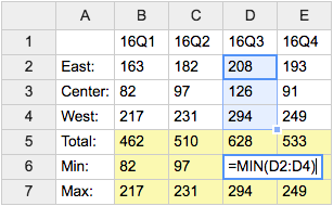
- Category: DatabaseAndFormsVariables, EditingAndContentUpdateVariables, FormattingAndRenderingVariables, TablesAndSpreadsheetsVariables
- Related: See TWikiSheetPlugin for more details (this topic)
VOTE{ id="..." } -- define a poll in a TWiki topic
- The
%VOTE{}%variable is handled by the VotePlugin. - Syntax:
%VOTE{ id="..." select1="..., ..., ..." }% - Parameters:
Parameter Description Example idThe identifier of the poll. You can have multiple independent votes in the same topic. id="Dining"selectNDefines the name of a select vote, where you select one from a ranges of options. Nis a number that identifies this item within the poll e.g.select1,select2etc. You must number allselectandstarsparameters uniquely and sequentially (e.g.select1 stars2 select3select1="Drink"optionsNEach selectNmust have a correspondingoptionsNthat defines a comma-separated list of the options that can be selected between.options1="Beer,Wine,Milk"starsNDefines the name of a rate vote, where you rate something by giving it a number of stars. Nis a number that identifies this item within the poll e.g.select1,stars2etc. You must number allselectandstarsparameters uniquely and sequentially (e.g.select1 stars2 select3stars2="Usability"widthNEach starsNmust have a correspondingwidthN. This gives the number of stars to show e.g.width1="5"will show 5 stars.width2="10"formatNDefines the format of the results display. See formatting results, below. format="$large"chartNDefines the format of a single bar in the results bar chart generated for the corresponding select(forselecttype only). See formatting results, below.chart="<p>$option $score</p>"separatorDefines the string to be used to separate each row in the result. separator="<br/>"globalIf set to "off", this makes theidlocal to this topic (the default). If set to"on"it will be a global poll that can be accessed from many topics.global="on"openIf set to "off"this is a closed vote. If set to"on"it is open (the default)open="on"secretIf set to "off", then the database will record who voted. If set to"on", votes are secret (the default)secret="on"savetoIf set to the name of a topic, the poll results will be appended to the end of that topic. The results are formatted as a TWiki table for easy post-processing. saveto="Main.VoteResults"bayesianIf set to "on", rating averages will be computed using the Bayesian average of this item against all the other items that have the same item in theirstarsfield. This requires all the participating %VOTEs to beglobal, or to save their results to the same place usingsaveto. See http://www.thebroth.com/blog/118/bayesian-rating for more information about Bayesian rating. bayesian="off"submitIf set to "off", this makes the %VOTE display the results of the vote without prompting for any input. This is useful when - for example - you want to show the results of a global vote, without permitting more voting. - Example:
%VOTE{ id="FavouriteMeal" select1="Drink" options1="Beer,Wine,Milk,Water" select2="Food" options2="Steak,Bread,Pasta,Pizza" }%shows two selectors named "Drink" and "Food", respectively, and a "Vote" button - Category: ApplicationsAndComponentsVariables, DatabaseAndFormsVariables
- Related: VotePlugin (this topic)
Categories:
Administration, Applications & Components, Attachments & Files, Charting & Drawing, Database & Forms, Date & Time, Development, Editing & Content Update, Email & Notification, Export & Publishing, Formatting & Rendering, Import, Linking & Navigation, Searching & Listing, Security & Access Control, Skins & Templates, System Information, Tables & Spreadsheets, UI& Visualization, Users & Authentication, Workflow & Automation
 Edit | Attach |
 Topic revision: r1 - 2012-11-11 - TWikiContributor

 Site map
 Blog web
 Index
Index Search
 Search extensions
 Search by tags
 Changes
 Notifications
 RSS Feed
 Statistics
 Preferences
 Community
  Readme first!
 Rate extensions!
 Add-Ons
  Development topics
 Idea topics
 Plugins
  Development topics
 Idea topics
 Skins
Skins  Development topics
 Idea topics
 Code Contribs
  Development topics
 Idea topics


 Account
 Ideas, requests, problems regarding TWiki? Send feedback. Ask community in the support forum.
Copyright © 1999-2026 by the contributing authors. All material on this collaboration platform is the property of the contributing authors.