TWiki Variables » Search » Category: Formatting & Rendering
Variables in this category:
- AUTOCOMPLETE{} -- autocomplete input field for use in HTML forms
- BUBBLESIG -- show bubble box and user signature with profile picture icon
- CALENDAR -- show a monthly calendar with highlighted events
- CODE{"language"} -- highlight source code fragments for many languages
- COLORPICKER{} -- color picker for use in HTML forms for TWiki applications
- DASHBOARD -- build a dashboard with banner and boxes
- DATEPICKER{} -- pop-up calendar to select a date for use in HTML forms
- FLOWCHART{} -- create a flowchart from topic text
- GAUGE{ attributes } -- create graphical images of gauges, typically used for dashboards
- HIERARCHICALSELECT{ attributes } -- display hierarchical multi-level drop-down menus
- JQENDTAB -- end a JQuery tab within a tab pane
- JQENDTABPANE -- end a JQuery tab pane
- JQTAB -- start a JQuery tab within a tab pane
- JQTABPANE -- start a JQuery tab pane
- NOTIFYAUTHORS{} -- show button to notify authors of a discussion thread via e-mail
- PERCENTCOMPLETE{} -- percent complete selector for use in HTML forms
- QRCODE -- create QR Code (a matrix barcode) in TWiki pages
- RENDERFORM -- render TWiki Forms data within a topic
- RENDERLIST -- render bullet lists in a variety of formats
- SLIDESHOWEND -- end slideshow
- SLIDESHOWSTART -- convert a topic with headings into a slideshow
- TABLE{ attributes } -- control attributes of tables and sorting of table columns
- TWIKISHEET{} -- enable TWiki Sheet (spreadsheet) and set options
- TWISTY{ attributes } -- dynamically open and close sections of content
- USERSIG -- show user signature with profile picture icon
AUTOCOMPLETE{} -- autocomplete input field for use in HTML forms
- Combo box input field with autocomplete. Start typing to see matching options to pick from. The
%AUTOCOMPLETE{}%variable is handled by the AutocompletePlugin. - Syntax:
%AUTOCOMPLETE{ name="..." value="..." options="..., ..." }% - Parameters:
Parameter Description Default Example nameName of input field (required) name="Mood"valueForm field value ""value="Happy"optionsComma-space separated list of autocomplete options. Example options when type="values"is used:
options="1: One, 2: Two, 3: Three"- when a user picks optionThree, the input field will have text3inserted.""options="Happy, Indifferent, Sad"sizeSize of input field, in number of characters "40"size="20"typeTypes of autocomplete:
•type=""(empty): Simple autocomplete
•type="restrict": Restrict input to list of autocomplete options. The value in the input field will be cleared if it does not match one of the autocomplete options. Partial input is expanded - for example if one of the options is "JavaScript" and the user typed "ja", the input field is expanded to "JavaScript" on focus loss.
•type="values": Define inserted values that are different to the displayed autocomplete options. An autocomplete option is defined asvalue: title, where thevalueis the text inserted into the input field when picking thetitleoption.
•type="restrict, values": Types of autocomplete can be combined.""type="restrict"idID of input field (none) id="mood"classAdd additional class(es) to input field, default is "twikiInputField twikiEditFormTextField autocompleteTextField"""class="myClass"styleAdd CSS to input field. A width: num;is already added, wherenumis calculated from thesizeparameter; thewidthcan be overloaded.""style="color: blue;"selectstyleCSS of select element ""selectstyle="color: blue;"containerstyleCSS of autocomplete container div ""containerstyle="font-size: 90%;"... Additional HTML 4 and HTML 5 attributes can be specified for the input field: formname,maxlength,onblur,onfocus,onchange,onselect,onmouseover,onmouseout,pattern,placeholder,spellcheck,tabindex,titleplaceholder="How do you feel?" - Example:
<form action="...">
%AUTOCOMPLETE{ name="Mood" value="Indifferent" options="Happy, Indifferent, Sad" size="10" }%
<form> - Expands to:
- Category: ApplicationsAndComponentsVariables, DatabaseAndFormsVariables, EditingAndContentUpdateVariables, FormattingAndRenderingVariables
- Related: AutocompletePlugin, TWikiForms (this topic)
BUBBLESIG -- show bubble box and user signature with profile picture icon
- Syntax:
%BUBBLESIG{WikiName}%or%BUBBLESIG{WikiName - YYYY-MM-DD}% - The parameter can be either just the WikiName of a user, or by convention the WikiName followed by a dash and the date
- Example:
-- %BUBBLESIG{TWikiGuest - 2026-06-01}% - Expands to:
-- TWiki Guest - 2026-06-01
- Category: EditingAndContentUpdateVariables, FormattingAndRenderingVariables, UsersAndAuthenticationVariables
- Related: USERREPORT, USERSIG, UserList, UserReports (this topic)
CALENDAR -- show a monthly calendar with highlighted events
- Events are defined by bullets, see CalendarPlugin for details. The
%CALENDAR{}%variable is handled by the CalendarPlugin. - Syntax:
%CALENDAR{ parameters }% - Parameters:
Parameter Description Default year="yyyy"The year Current year year="+yy"or"-yy"Relative year Current year month="mm"The month Current month month="+mm"or"-mm"relative month Current month gmtoffset="+/-hh"Timezone expressed as number of hours offset from GMT Server timezone topic="TopicName"Topic containing events The topic containing the tag topic="Web.TopicName1, Web.TopicName2"Topics containing events The topics containing the tags web="Webname"Web containing the event topic The current web lang="language"Language: First few characters of "English", "Francais", "Deutsch", "Espagnol", "Portugues", "Nederlands", "Italiano", "Norsk", "Svenska", "Dansk", "Suomi", "Magyar", "Polski "English"daynames="Mon|Tue|..."Custom day names "Monday|Tuesday|
Wednesday|Thursday|
Friday|Saturday|
Sunday"header="..."Text at the top of the calendar; use $mfor current month,$yfor yearCurrent month and year weekstartsonmonday="1"or"0"Flag to start week on Monday "0"(Sunday)showdatenumbers="0"Show day numbers 1...31 in date cells. Note that showdatenumbers=1means thatHTML::CalendarMonthSimplewill add the date numbers to the cells. Ifshowdatenumbers=0, then the plugin adds the date numbers. The result of this is that a calendar will always show the date numbers."0"(except withaslist="1", see below)showweekdayheaders="1"Show the weekday headers "0"weekdayheadersbig="0"If enabled, show weekday headers in bold cell headings "1"cellalignment="left"Horizontal cell alignment of day cells: "left", "center", "right", "justify", "char" "center"vcellalignment="middle"Vertical cell alignment of day cells: "top", "middle", "bottom", "baseline" "top"cellheight="n"Height in pixels of each cell in the calendar Minimum height needed format="..."How to highlight a date See Event Formatting below width="n"or"n%"Width of calendar table in pixels or percent Minimum width needed sharpborders="n"If set to 1, this gives very crisp edges between the table cells. If set to 0 standard HTML cells are used. "1"border="n"Border width of calendar table. (sharpborders="0" required) "1"cellspacing="n"Spacing of calendar cells. (sharpborders="0" required) "0"cellpadding="n"Padding of calendar cells. (sharpborders="0" required) "3"nowrap="1"or"0"Prevent cell content from wrapping "0"bgcolor="#nnnn"Default background color of all cells unless redefined by other color settings below (use an HTML color-code like "#000000" as defined in StandardColors) "white"contentcolor="#nnnn"Default content color of all cells unless redefined "black"headercolor="#nnnn"Background color of the Month+Year header The web bgcolor headercontentcolor="#nnnn"Content color of the Month+Year header contentcolor setting weekdayheadercolor="#nnnn"Background color of weekdays' headers bgcolor setting weekdayheadercontentcolor=
"#nnnn"Content color of weekdays' headers contentcolor setting weekendheadercolor="#nnnn"Background color of weekends' headers bgcolor setting weekendheadercontentcolor=
"#nnnn"Content color of weekends' headers contentcolor setting weekdaycolor="#nnnn"Background color of weekday cells bgcolor setting weekdaycontentcolor="#nnnn"Content color of weekday cells contentcolor setting weekendcolor="#nnnn"Background of weekend cells light gray weekendcontentcolor="#nnnn"Content color of weekend cells contentcolor setting todaycolor="#nnnn"Background of today's cell The web bgcolor todaycontentcolor="#nnnn"Content color of today's cell contentcolor setting and other attributes of HTML::CalendarMonthSimple aslistControls whether events displayed in calendar style ( aslist=0) or list style (aslist=1). Note that specifyingaslist=1forcesshowdatenumbers=1. This is done to ensure that the date number is formatted according todatenumberformatand that only the days that have an event are listed."0"daysSpecifies how many days of calendar data to list. Only valid if aslist="1"."1"monthsSpecifies how many months of calendars to display. Only valid if aslist="0"."1"datenumberformatSpecifies formatting for the date number in each cell. The formatting codes accepted are the same as those for the %GMTIME%variable.$day(ifaslist="0")
* $day $mon $year(ifaslist="1")todaydatenumberformatSpecifies formatting for the date number for the current day (today) in the calendar. The formatting codes accepted are the same as those for the %GMTIME%variable.datenumberformatmultidayformatSpecifies formatting of the description for multi-day events. See Multi-Day Event Formatting for details. $description - Example:
%CALENDAR{ month="2" year="2026" bgcolor="cyan" }%shows a February 2026 calendar - Category: DateAndTimeVariables, FormattingAndRenderingVariables
- Related: DATE, DISPLAYTIME, GMTIME{"format"}, SERVERTIME, CalendarPlugin (this topic)
CODE{"language"} -- highlight source code fragments for many languages
- The
%CODE{}%and%ENDCODE%variables are handled by the SyntaxHighlightingPlugin. - Syntax:
%CODE{"language"}% ...code... %ENDCODE% - Parameters:
Parameter Description Default "..."or
lang="..."Source language. Supported languages: ada,asm,awk,bash,changelog,cpp,csh,c,delphi,diffs,diff,diffu,dylan,eiffel,elisp,Name:,forth,fortran_pp,fortran,haskell,html,icon,idl,inf,javascript,java,ksh,lua,m4,mail,makefile,matlab,nroff,oberon2,objc,outline,oz,pascal,perl,php,postscript,pyrex,python,rfc,ruby,scheme,sh,skill,Smalltalk,sml,sql,states,synopsys,tcl,tcsh,tex,vba,verilog,vhdl,vrml,wmlscript,zsh(none, required) num="..."Show line numbers next to the source code. An integer indicates the start number. Also "on"and"off""off"step="..."Increment line numbers with the given step. Negative numbers will decrement. "1"style="..."Style of box around the source code light gray box numstyle="..."Style of line number column light brown box - Example:
<sticky>
%CODE{"cpp" num="on"}%
void foo() {
print("Do stuff.\n");
}
%ENDCODE%
</sticky>1void foo() { 2 print("Do stuff.\n"); 3 }- Category: FormattingAndRenderingVariables, UIAndVisualizationVariables
- Related: SyntaxHighlightingPlugin (this topic)
COLORPICKER{} -- color picker for use in HTML forms for TWiki applications
- The
%COLORPICKER{}%variable is handled by the ColorPickerPlugin. - Syntax:
%COLORPICKER{ name="..." value="..." }% - Parameters:
Parameter Description Default Example nameName of input field (required) name="text_color"valueInitial color value, in hexadecimal notation for the combination of Red, Green, and Blue color values (RGB). (none) value="#0000ff"sizeSize of input field, in number of characters (browser default) size="8"classCSS class of input field or the rectangular color block (none) class="twikiInputField"styleStyle of input field or the rectangular color block (none) style="width: 190px; height: 32px"typeType of color widget:
•"below"- color picker is located below the input field;
•"popup"- pop-up a color picker window when clicking the button next to the input field
(this uses very little vertical space);
•"view"- a read-only rectangular block colored in the color value (no color picker);
•"view-hex"- likeview, in addition shows the color value as an RGB hexadecimal code (no color picker);type="below"type="view-hex"Additional parameters can be supplied; they will be added to the HTML input field or the rectangular color block. - Example:
<form action="...">
%COLORPICKER{ name="text_color" value="#123456" class="twikiInputField" type="popup" }%
<form>
Renders as:
- Category: ApplicationsAndComponentsVariables, DatabaseAndFormsVariables, EditingAndContentUpdateVariables, FormattingAndRenderingVariables, UIAndVisualizationVariables
- Related: ColorPickerPlugin, TWikiForms (this topic)
DASHBOARD -- build a dashboard with banner and boxes
- Use this variable to quickly create dashboards for intranet home, team homepages, project homepages and knowledge bases. See the TWikiDashboardAddOn for details on enabling and using the
%DASHBOARD{...}%variable. - Syntax:
%DASHBOARD{ section="..." ... }% - Example:
%DASHBOARD{ section="dashboard_start" }%
%DASHBOARD{ section="banner" image="..." title="..." }%
%DASHBOARD{ section="box_start" title="Box 1 title" }%
Box 1 content
%DASHBOARD{ section="box_end" }%
%DASHBOARD{ section="box_start" title="Box 2 title" }%
Box 2 content
%DASHBOARD{ section="box_end" }%
...
%DASHBOARD{ section="dashboard_end" }% - Category: AdministrationVariables, ApplicationsAndComponentsVariables, DevelopmentVariables, FormattingAndRenderingVariables, UIAndVisualizationVariables
- Related: TWikiDashboardAddOn (this topic)
DATEPICKER{} -- pop-up calendar to select a date for use in HTML forms
- The
%DATEPICKER{}%variable is handled by the DatePickerPlugin. - Syntax:
%DATEPICKER{ name="..." value="..." }% - Parameters:
Parameter Description Default Example nameName of input field.
φ: No output is shown if the name parameter is missing, but the CSS and Javascript are loaded.(requiredφ) name="Start"valueInitial date value. ""(today)value="2012-12-31"formatFormat of resulting date value.
•%a- abbreviated weekday name
•%A- full weekday name
•%b- abbreviated month name
•%B- full month name
•%C- century number
•%d- the day of the month (00 ... 31)
•%e- the day of the month (0 ... 31)
•%H- hour (00 ... 23)
•%I- hour (01 ... 12)
•%j- day of the year ( 000 ... 366)
•%k- hour (0 ... 23)
•%l- hour (1 ... 12)
•%m- month (01 ... 12)
•%M- minute (00 ... 59)
•%n- a newline character
•%p- "PM" or "AM"
•%P- "pm" or "am"
•%S- second (00 ... 59)
•%s- number of seconds since Epoch (since Jan 01 1970 00:00:00 UTC)
•%t- a tab character
•%U,%W,%V- the week number. The week 01 is the week that has the Thursday in the current year, which is equivalent to the week that contains the fourth day of January. Weeks start on Monday.
•%u- the day of the week (1 ... 7, 1 = MON)
•%w- the day of the week (0 ... 6, 0 = SUN)
•%y- year without the century (00 ... 99)
•%Y- year including the century (ex. 2012)
•%%- a literal%character"%Y-%m-%d"format="%e %b %Y"idID of input field, optional. "id_"+ nameid="idStart"sizeSize of input field, in number of characters. (calculated as needed) size="12"classCSS class of input field. "twikiInputField"class="dateField"Additional HTML input field attributes, such as alt,disabled,maxlength,onblur,onchange,onfocus,readonly,style,tabindex,title - Example:
<form action="...">
%DATEPICKER{ name="Start_Date" }%
<form> - Expands to:
- Category: ApplicationsAndComponentsVariables, DatabaseAndFormsVariables, DateAndTimeVariables, EditingAndContentUpdateVariables, FormattingAndRenderingVariables, UIAndVisualizationVariables
- Related: DatePickerPlugin, TWikiForms (this topic)
FLOWCHART{} -- create a flowchart from topic text
- The
%FLOWCHART{}%,%FLOWCHART_START%and%FLOWCHART_STOP%variables are handled by the FlowchartPlugin. - Syntax:
%FLOWCHART{}%...%FLOWCHART_START%...%FLOWCHART_STOP% - Parameters of
%FLOWCHART{}%:Parameter Description item-wWidth for the flowchart's itens area item-hHeight for the flowchart's itens area-wWidth of the area of the flowchart's itens area-hHeight of the area of the flowchart's itens percentPercentage of the PNG size presented in relation to the standard of the generated SVG text-sizeSize in pixels of the font text tag-styleStyle for the imgtag - Example:
%FLOWCHART%
%FLOWCHART_START%
---++ Flowchart Start
* Type: Start
---++ Question 1
* Type: Question
* Yes: trunk1
* No: trunk2
---++ Start of %FLOWCHART_BR% Trunk 1
* Id: trunk1
* Color: 70B070
---++ End of Trunk 1
* Type: End
---++ Start of %FLOWCHART_BR% Trunk 2
* Id: trunk2
* Color: E0B040
---++ End of Trunk 2
* Type: End
%FLOWCHART_STOP% - Category: FormattingAndRenderingVariables, UIAndVisualizationVariables
- Related: FlowchartPlugin, FlowchartPluginExample (this topic)
GAUGE{ attributes } -- create graphical images of gauges, typically used for dashboards
- The
%GAUGE{}%variable is handled by the GaugePlugin. - Syntax:
%GAUGE{ type="..." name="..." value="..." }% - Supported attributes:
Attribute Comment Default typeThe type of gauge, type="tambar"for target measure bar, ortype="trend"for trend iconGlobal TYPEsettingnameName to uniquely identify the gauge file that is auto-created. None; required for tambarvalueFor tambar: The actual value of the gauge
Fortrend: Positive = arrow up, 0 = arrow right, negative = arrow downNone. Show "no data" if missing altAlternate text for image Value is valueparameterwidthDefines the width of the gauge in pixels. Global <type>_WIDTHsettingheightDefines the height of the gauge in pixels. Global <type>_HEIGHTsettingscaleFor tambar: Defines the number and position of the scales. For example a value of"5, 12, 35, 57"denotes that there are three regions on the bar gauge,"5...12","12...35"and"35...57".
Fortrend: N/AGlobal <type>_SCALEsettingcolorsFor tambar: List of colors, each region has two colors. Fortrend: N/AGlobal <type>_COLORSsetting - Examples:
-
%GAUGE{ type="tambar" name="t1" scale="0, 10, 20, 40" value="27" }%shows
-
%GAUGE{ type="trend" name="t2" value="-3" }%shows
-
- Category: ChartingAndDrawingVariables, FormattingAndRenderingVariables, UIAndVisualizationVariables
- Related: GaugePlugin, GaugePluginTests (this topic)
HIERARCHICALSELECT{ attributes } -- display hierarchical multi-level drop-down menus
- The
%HIERARCHICALSELECT{}%variable is handled by the HierarchicalSelectPlugin. - Syntax:
%HIERARCHICALSELECT{ topic="MenuDefinition" ... }% - Parameters:
Parameter Description Default topicTopic from which to read the menu definition (required) webWeb from which to read the menu definition current web keyString to use as the basis for naming of HTML form elements Derived from menu topic levelIf specified, select a menu level (integer starting from 0) to display All levels parse_keywordsFlag: Nonzero sets parsing mode where first word of menu line is return-value keyword, remainder is text to display Entire line used as both return value and display text - Example with three levels:
%HIERARCHICALSELECT{ web="TWiki" topic="HierarchicalSelectPluginExample" level="0" names="country,subdivision,region" }%
%HIERARCHICALSELECT{ web="TWiki" topic="HierarchicalSelectPluginExample" level="1" }%
%HIERARCHICALSELECT{ web="TWiki" topic="HierarchicalSelectPluginExample" level="2" }% - Category: DatabaseAndFormsVariables, FormattingAndRenderingVariables, UIAndVisualizationVariables
- Related: HierarchicalSelectPlugin, HierarchicalSelectPluginExample, TWikiTemplates (this topic)
JQENDTAB -- end a JQuery tab within a tab pane
- This variable is handled by the JQueryPlugin. For description see JQTABPANE
- Syntax:
%JQTABPANE% %JQTAB{"Tab 1"}% ... %JQENDTAB% %JQTAB{"Tab 2"}% ... %JQENDTAB% ... %JQENDTABPANE% - Example: See JQTABPANE
- Category: ApplicationsAndComponentsVariables, FormattingAndRenderingVariables
- Related: JQENDTABPANE, JQTAB, JQTABPANE, JQueryPlugin (this topic)
JQENDTABPANE -- end a JQuery tab pane
- This variable is handled by the JQueryPlugin. For description see JQTABPANE
- Syntax:
%JQTABPANE% %JQTAB{"Tab 1"}% ... %JQENDTAB% %JQTAB{"Tab 2"}% ... %JQENDTAB% ... %JQENDTABPANE% - Example: See JQTABPANE
- Category: ApplicationsAndComponentsVariables, FormattingAndRenderingVariables
- Related: JQENDTAB, JQTAB, JQTABPANE, JQueryPlugin (this topic)
JQTAB -- start a JQuery tab within a tab pane
- This variable is handled by the JQueryPlugin. For description see JQTABPANE
- Syntax:
%JQTABPANE% %JQTAB{"Tab 1"}% ... %JQENDTAB% %JQTAB{"Tab 2"}% ... %JQENDTAB% ... %JQENDTABPANE% - Supported parameters:
Parameter: Description: Default: "..."Name of tab, shown as tab label (required) beforeWhen switching tabs, this is the Javascript fragment to be executed just before the tab is displayed ""afterThis Javascript handler is to be executed after the tab has been made visible ""afterloadThis Javascript handler will be called when content loaded asynchronously has finished loading (using the urlparameter described below). Depending on the network latency and server response time, this can be significantly later than execution of theafterhandler above""urlLink from where to load the content of the tab asynchronously when selecting this tab; the result of the addressed handler will replace the content area; if no url is set the content of the TAB ... ENDTAB area will be shown when the tab is selected ""containerContainer element ( ".someClass"or"#someID") where content will be loaded asynchronously using Ajax; this is only used together withurl".jqTabContents"classAdd additional class to existing tab class "jqTab""" - Example: See complete example at JQTABPANE
- Example: Asynchronously load the content of TimBernersLee topic into a tab content:
%JQTABPANE%
%JQTAB{ "Tim Berners-Lee" url="%SCRIPTURL{view}%/TWiki06x01/TimBernersLee?skin=text" }%
%ICON{processing}%
%JQENDTAB%
%JQENDTABPANE% - Category: ApplicationsAndComponentsVariables, FormattingAndRenderingVariables
- Related: JQENDTAB, JQENDTABPANE, JQTABPANE, JQueryPlugin (this topic)
JQTABPANE -- start a JQuery tab pane
- Create nice looking horizontal tab panes in TWiki topics. Write a sequence of
%JQTAB{"..."}%and%JQENDTAB%pairs, and enclose them in%JQTABPANE%and%JQENDTABPANE%. Tab panes can be nested, e.g. within one tab you can add another tab pane. These variable are handled by the JQueryPlugin. - Syntax:
%JQTABPANE{ select="1" }% %JQTAB{"Tab 1"}% ... %JQENDTAB% %JQTAB{"Tab 2"}% ... %JQENDTAB% ... %JQENDTABPANE% - Supported parameter:
Parameter: Description: Default: select=""Select a tab pane, default is the first tab. "1" - Note: A tab can be selected with a
tabURL parameter using%JQTABPANE{ select="%URLPARAM{tab}%" }% - Example:
%JQTABPANE%
%JQTAB{"Tab 1"}%
Tab 1 content...
%JQENDTAB%
%JQTAB{"Tab 2"}%
Tab 2 content...
%JQENDTAB%
%JQENDTABPANE% - Renders as:
Tab 1
Tab 1 content...Tab 2
Tab 2 content... - Category: ApplicationsAndComponentsVariables, FormattingAndRenderingVariables
- Related: JQENDTAB, JQENDTABPANE, JQTAB, JQueryPlugin (this topic)
NOTIFYAUTHORS{} -- show button to notify authors of a discussion thread via e-mail
- Use this plugin to add a "notify authors" button to topics. When pressed, all authors on the topic will be notified by e-mail. The
%NOTIFYAUTHORS%variable is handled by the NotifyAuthorsPlugin. - Syntax:
%NOTIFYAUTHORS{ ... }% - Parameters:
φ Note: The default is defined in theParameter Description Default action=""or
action="showbutton"Show "notify authors" button ""action="notify"Notify all authors by e-mail. The same can be achieved with URL parameter notifyauthors_action=notify.""action="getemailtemplate"Get e-mail body from template, used in notification confirmation dialog box. Add encode="1"to entity-encode the content for an HTML textarea element.""anchor="..."After notification, jump to named anchor (omit the #)"NotifyAuthorsButton"φ{Plugins}{NotifyAuthorsPlugin}{AnchorName}configure setting. - Example:
%NOTIFYAUTHORS% - Expands to:
%NOTIFYAUTHORS% - Category: ApplicationsAndComponentsVariables, EmailAndNotificationVariables, FormattingAndRenderingVariables
- Related: NotifyAuthorsPlugin, CommentPlugin (this topic)
PERCENTCOMPLETE{} -- percent complete selector for use in HTML forms
- The
%PERCENTCOMPLETE{}%variable is handled by the PercentCompletePlugin. - Syntax:
%PERCENTCOMPLETE{ name="..." value="..." }% - Parameters:
Parameter Description Default Example nameName of selector (required) name="Progress"valueInitial value, range 0 to 100. "0"value="70" - Example:
<form action="...">
%PERCENTCOMPLETE{ name="Progress" value="30" }%
<form> - Expands to:
- Category: ApplicationsAndComponentsVariables, DatabaseAndFormsVariables, EditingAndContentUpdateVariables, FormattingAndRenderingVariables, UIAndVisualizationVariables
- Related: PercentCompletePlugin, TWikiForms (this topic)
QRCODE -- create QR Code (a matrix barcode) in TWiki pages
-
 The
The %QRCODE{}%variable is handled by the QRCodePlugin - Syntax:
%QRCODE{ "..." ... }% - Parameter
"..."- text to encode as QR Code. - Parameter
ecc="..."- error Correction Capability. Valid values"L","M","Q","H". Default"M". - Parameter
version="..."- symbol version of QR Code, or size of matrix. Valid values"1"..."40", and"auto"for automatic versioning. Default"8". - Parameter
size="..."- module size, e.g. pixel size of a block (bit) that makes up the matrix of the barcode. Default"4". - Parameter
format="..."- format of HTMLimgtag of generated QR Code image. Supported variables:$urlpath- URL path of image,$width- image width,$height- image height. Default:"<img src='$urlpath' width='$width' height='$height' border='0' alt='' />". - Example:
%QRCODE{ "http://twiki.org/" version="2" size="3" }%returns above QR Code. - Category: ExportAndPublishingVariables, FormattingAndRenderingVariables, UIAndVisualizationVariables
- Related: QRCodePlugin (this topic)
RENDERFORM -- render TWiki Forms data within a topic
- The
%RENDERLIST%variable is handled by the RenderFormPlugin. - Syntax:
%RENDERFORM{ "ATWikiFormDefinition" }% - Parameters:
Parameter Description Default / Example dateformatoverwrites the JSCALENDARDATEFORMAT preference for date fields dateformat="%d %b %Y"donotnotifydisables notifications undefined / donotnotify="on"form(required attribute) a name of a topic with a TWikiForms definition undefined / form="MyTestForm"hiddena comma separated list of form field names to hide in all modes undefined / hidden="Field1,Field2"hideheaderif set, disables the form header hideheader="no"layouta topic with a layout (see Form Layout section); syntax: layout="<topic>#<layout name>"; if layout name is omitted a default layout will be taken undefined / layout="TestFormLayout#test1"moderender mode of the form, allowed values: create (default), edit, view (default if topicexists)mode="create"onlynewtopicdisables overwrite of existing topics onlynewtopic="on"onlywikinamedisallows the usage of non-TWiki.WikiWords for topic names onlywikiname="on"orderchanges the display order of form fields; order value is a comma separated list of field names; if the order list is incomplete all missing and unhidden form fields will be added; there are special values for order: [:alpha:], [:dalpha:], [:num:] and [:dnum:], e.g. order="[:alpha:]" to sort all fields alphanumerical undefined / order="Field1, Field2"scriptchanges the behavior of edit/create modes; allowed values: save - saves the form data; edit - edit the resulting topic script="save"templatea template name for predefined attributes undefined / template="helpdesk"templatetopica template topic; useful for the create mode undefined / templatetopic="MyHelpDeskTopicTemplate"textthe topic text; text will be ignored if a templatetopic is defined undefined / text="my small topic text"topican existing topic for edit and view mode or a topic template name for a new topic (create mode) (e.g. TestFormDataXXXXXXXXXX) topic="%TOPIC%XXXXXXXXXX"/topic="TestFormData%SERVERTIME{$epoch}%"topicparenta topic parent; useful for the create mode; if undefined the form topic will be used topicparent="%WEB%.%TOPIC%"/topicparent="MyHelpDesk" - Example:
%RENDERLIST{ "IT.HelpDeskForm" }% - Category: ApplicationsAndComponentsVariables, DatabaseAndFormsVariables, EditingAndContentUpdateVariables, FormattingAndRenderingVariables, UIAndVisualizationVariables
- Related: RenderFormPlugin, TWikiForms (this topic)
RENDERLIST -- render bullet lists in a variety of formats
- The
%RENDERLIST%variable is handled by the RenderListPlugin - Syntax:
%RENDERLIST% - Syntax:
%RENDERLIST{ "org" focus="Sales.WestCoastTeam" }% - Example:
%RENDERLIST{ "org" }%
* [[Eng.WebHome][Engineering]]
* [[Eng.TechPubs][Tech Pubs]]
* [[Sales.WestCoastTeam][Sales]]
* [[Sales.EastCoastTeam][East Coast]]
* [[Sales.WestCoastTeam][West Coast]] - Category: FormattingAndRenderingVariables
- Related: RenderListPlugin (this topic)
SLIDESHOWEND -- end slideshow
- The
%SLIDESHOWEND%variable is handled by the SlideShowPlugin - Syntax:
%SLIDESHOWEND% - Example: See SLIDESHOWSTART
- Category: FormattingAndRenderingVariables, UIAndVisualizationVariables
- Related: SLIDESHOWSTART, SlideShowPlugin (this topic)
SLIDESHOWSTART -- convert a topic with headings into a slideshow
- The
%SLIDESHOWSTART%variable is handled by the SlideShowPlugin - Syntax:
%SLIDESHOWSTART% - Syntax:
%SLIDESHOWSTART{ template="MyOwnSlideTemplate" }% - Example:
%SLIDESHOWSTART%
---++ Sample Slide 1
* Bullet 1
* Bullet 2
---++ Sample Slide 2
* Bullet 1
* Bullet 2
%SLIDESHOWEND% - Category: FormattingAndRenderingVariables, UIAndVisualizationVariables
- Related: SLIDESHOWEND, SlideShowPlugin (this topic)
TABLE{ attributes } -- control attributes of tables and sorting of table columns
- The
%TABLE{}%variable is handled by the TablePlugin - Syntax:
%TABLE{ attributes }%
- Supported attributes:
Argument Comment Default value Example sortSet table sorting by clicking headers "on"or"off".unspecified sort="on"initsortColumn to sort initially ( "1"to number of columns).unspecified initsort="2"initdirectionInitial sorting direction for initsort, set to"up"(descending) or"down"(ascending).unspecified initdirection="up"disableallsortDisable all sorting, both initsort and header sort. This is mainly used by plugins such as the EditTablePlugin to disable sorting in a table while editing the table. unspecified disableallsort="on"headerbgHeader cell background color. "#6b7f93"headerbg="#999999"headerbgsortedHeader cell background color of a sorted column. the value of headerbgheaderbgsorted="#32596c"headercolorHeader cell text color. "#ffffff"headercolor="#0000cc"databgData cell background color, a comma separated list. Specify "none"for no color, that is to use the color/background of the page the table is on."#edf4f9,#ffffff"databg="#f2f2f2,#ffffff"databgsortedData cell background color of a sorted column; see databg.the values of databgdatabgsorted="#d4e8e4,#e5f5ea"datacolorData cell text color, a comma separated list. unspecified datacolor="#0000CC, #000000"tableborderTable border width (pixels). "1"tableborder="2"tableframeTable frame, set to "void"(no sides),"above"(the top side only),"below"(the bottom side only),"hsides"(the top and bottom sides only),"lhs"(the left-hand side only),"rhs"(the right-hand side only),"vsides"(the right and left sides only),"box"(all four sides),"border"(all four sides).unspecified tableframe="hsides"tablerulesTable rules, set to "none"(no rules),"groups"(rules will appear between row groups and column groups only),"rows"(rules will appear between rows only),"cols"(rules will appear between columns only),"all"(rules will appear between all rows and columns).unspecified tablerules="rows"cellpaddingCell padding (pixels). "0"cellpadding="0"cellspacingCell spacing (pixels). "0"cellspacing="3"cellborderCell border width (pixels). unspecified cellborder="0"valignVertical alignment of cells and headers, set to "top","middle","bottom"or"baseline".unspecified valign="top"headervalignVertical alignment of header cells; overrides valign.unspecified headervalign="top"datavalignVertical alignment of data cells; overrides valign.unspecified datavalign="top"headeralignHeader cell alignment, one value for all columns, or a comma separated list for different alignment of individual columns. Set to "left","center","right"or"justify". Overrides individual cell settings.unspecified headeralign="left,right"dataalignData cell alignment, one value for all columns, or a comma separated list for different alignment of individual columns. Set to "left","center","right"or"justify". Overrides individual cell settings.unspecified dataalign="center"tablewidthTable width: Percentage of window width, or absolute pixel value. unspecified tablewidth="100%"columnwidthsColumn widths: Comma delimited list of column widths, percentage or absolute pixel value. unspecified columnwidths="80%,20%"headerrowsNumber of header rows to exclude from sort. (will be rendered in a HTML theadsection)(determined automatically) headerrows="2"footerrowsNumber of footer rows to exclude from sort. (will be rendered in a HTML tfootsection)"0"footerrows="1"idUnique table identifier string, used for targeting a table with CSS. tableN(where N is the table order number on the page)id="userTable"summaryTable summary used by screenreaders: A summary of what the table presents. It should provide an orientation for someone who listens to the table. unspecified summary="List of subscribed users"captionTable caption: A title that will be displayed just above the table. unspecified caption="Users"
- Example:
%TABLE{ tableborder="0" cellpadding="4" cellspacing="3" cellborder="0" }%
| *A1* | *B1* |
| A2 | B2 | - Category: FormattingAndRenderingVariables, TablesAndSpreadsheetsVariables
- Related: See TablePlugin for more details (this topic)
TWIKISHEET{} -- enable TWiki Sheet (spreadsheet) and set options
- The
%TWIKISHEET{}%variable is handled by the TWikiSheetPlugin - Syntax:
%TWIKISHEET{ parameters }% - Supported parameters:
Parameter Description Example Default modeMode of operation:
•mode="classic"- regular TWiki table and an edit button; once pressed, the table switches into spreadsheet edit mode.
•mode="toggle"- spreadsheet in read-only mode and an edit button; once pressed, the table switches into spreadsheet edit mode.
•mode="toggle-edit"- like"toggle"but initial state is spreadsheet edit mode.
•mode="edit"- the table is always in spreadsheet edit mode.mode="edit"{Plugins}
{TWikiSheetPlugin}
{Mode}
configure
setting ("toggle")concurrentConcurrent editing. If enabled, multiple people can edit TWiki Sheet and see each other's changes. This includes editing cells, pasting a range of cells, drag-filling cells, adding/removing rows, adding/removing columns, and undo.
•concurrent="0"- disable concurrent editing; changes by others will be shown after a page reload.
•concurrent="1"- enable concurrent editing; changes by others will show up while editing TWiki Sheet.concurrent="1"{Plugins}
{TWikiSheetPlugin}
{ConcurrentEdit}
configure
setting ("0")saveOptionally disable save; useful to demo the plugin save="0"save="1"widthTable width in pixels; a horizontal scrollbar is added if needed width="500"(full window width) heightTable height in pixels; a vertical scrollbar is added if needed height="300"(full table height) colHeadersSet to "false"to disable the default column headers (A, B, C); set to a function for custom headers, such as:
colHeaders="function(index) { return String.fromCharCode(65+index) + ' (' + (index + 1) + ')'; }",
which will show headersA (1),B (2),C (3), ...colHeaders="false"colHeaders="true"rowHeadersSet to "false"to disable the default row headers (1, 2, 3)rowHeaders="false"rowHeaders="true"contextMenuDefines the right-click context menu; set to "false"to disable; set to array of available strings, such as:
contextMenu="['row_above', 'row_below', 'col_left', 'col_right', 'remove_row', 'remove_col', '---------', 'undo', 'redo']"contextMenu="false"contextMenu="true"fixedRowsTopFixed number of rows shown on top; takes effect if heightparameter is usedfixedRowsTop="1"(none) fixedColumnsLeftFixed number of columns shown on the left; takes effect if widthparameter is usedfixedColumnsLeft="2"(none) formulasFormula support; set to "false"to disable spreadsheet calculations in table cells, such as:=SUM(A1:A8)formulas="false"formulas="true"maxColsMaximum number of columns maxCols="10"(unlimited) maxRowsMaximum number of rows maxRows="1000"(unlimited) minSpareColsWhen set to 1 (or more), automatically add a new column at the right if there are no more empty columns minSpareCols="1"minSpareCols="0"minSpareRowsWhen set to 1 (or more), automatically add a new row at the bottom if there are no more empty rows minSpareRows="1"minSpareRows="0"wordWrapWord wrap; set to "false"to disable cell content wrapping if it does not fit in the fixed column widthwordWrap="false"wordWrap="true"more... Additional Handsontable options  can be used. Notes on types of values:
• Number value: Specify the number, such aswidth="500"
• String value: Enclose the string in single quotes, such aspreventOverflow="'horizontal'"
• Boolean value: Specify"true"or"false", such asmanualRowResize="true"
• Array value: Specify the array, such asmanualRowResize="[40, 50]"
• Object value: Specify the object, such ascolumnSorting="{ column: 2, sortOrder: true }"
• Function: Specify the JavaScript function, such as:
cells="function( row, col, prop ) { var cp = {}; if( row===0 ) { cp.readOnly = true; } return cp; }" - Example:
%TWIKISHEET{ mode="edit" save="0" }%
| | 16Q1 | 16Q2 | 16Q3 | 16Q4 |
| East: | 163 | 182 | 208 | 193 |
| Center: | 82 | 97 | 126 | 91 |
| West: | 217 | 231 | 294 | 249 |
| Total: | =SUM(B2:B4) | =SUM(C2:C4) | =SUM(D2:D4) | =SUM(E2:E4) |
| Min: | =MIN(B2:B4) | =MIN(C2:C4) | =MIN(D2:D4) | =MIN(E2:E4) |
| Max: | =MAX(B2:B4) | =MAX(C2:C4) | =MAX(D2:D4) | =MAX(E2:E4) |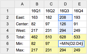
- Category: DatabaseAndFormsVariables, EditingAndContentUpdateVariables, FormattingAndRenderingVariables, TablesAndSpreadsheetsVariables
- Related: See TWikiSheetPlugin for more details (this topic)
TWISTY{ attributes } -- dynamically open and close sections of content
- The
%TWISTY{}%variable is handled by the TwistyPlugin. - Syntax:
%TWISTY{}% ... %ENDTWISTY% - See plugin topic for explanation of variables and attributes
- Example:
%TWISTY{}%
my twisty content
%ENDTWISTY% - Category: FormattingAndRenderingVariables, ApplicationsAndComponentsVariables
- Related: TwistyPlugin, TwistyContrib (this topic)
USERSIG -- show user signature with profile picture icon
- Syntax:
%USERSIG{WikiName}%or%USERSIG{WikiName - YYYY-MM-DD}% - The parameter can be either just the WikiName of a user, or by convention the WikiName followed by a dash and the date
- Example:
-- %USERSIG{TWikiGuest - 2026-06-01}% - Expands to:
-- TWiki Guest - 2026-06-01
- Category: EditingAndContentUpdateVariables, FormattingAndRenderingVariables, UsersAndAuthenticationVariables
- Related: BUBBLESIG, USERREPORT, UserList, UserReports (this topic)
Related Topics: TWikiVariables, TWikiVariablesSearch, TWikiVariablesQuickStartCategories: Administration, Applications & Components, Attachments & Files, Charting & Drawing, Database & Forms, Date & Time, Development, Editing & Content Update, Email & Notification, Export & Publishing, Formatting & Rendering, Import, Linking & Navigation, Searching & Listing, Security & Access Control, Skins & Templates, System Information, Tables & Spreadsheets, UI& Visualization, Users & Authentication, Workflow & Automation
 Edit | Attach |
 Topic revision: r1 - 2012-11-11 - TWikiContributor

 Site map
 Blog web
 Index
Index Search
 Search extensions
 Search by tags
 Changes
 Notifications
 RSS Feed
 Statistics
 Preferences
 Community
  Readme first!
 Rate extensions!
 Add-Ons
  Development topics
 Idea topics
 Plugins
  Development topics
 Idea topics
 Skins
Skins  Development topics
 Idea topics
 Code Contribs
  Development topics
 Idea topics


 Account
 Ideas, requests, problems regarding TWiki? Send feedback. Ask community in the support forum.
Copyright © 1999-2026 by the contributing authors. All material on this collaboration platform is the property of the contributing authors.